Tag:

Interior design

After announcing our move, I received many questions, so I thought I’d share the answers here in more detail. Who doesn’t love a good Q&A session? Let me know if I missed anything!

Thanks for your support. We are thrilled. Also read more about our new home in the SNEAK PEEK blog post.

xx shalice

How big is the house? Will the kids have to share rooms?

The house has 4 bedrooms. Given our family size, the boys will share one room and the girls will share another, which allows us to designate one room as a guest room and office space. It’s not perfect, but this setup balances our need for personal space and practicality. Our girls will miss having their own rooms.

How did you find it?

Reid was searching for cabins on Zillow when he decided to expand the search area by clicking “remove boundary.” That’s when this amazing house popped up. It was an unexpected find, but it immediately caught our interest with its unique features and potential.

What room are you most excited about?

It’s hard to choose just one room because the whole house is filled with features I love. The filtered light throughout the house is beautiful and creates a warm atmosphere. The stairway is perfect for photo shoots, which is great for our creative projects. The kitchen’s proximity to the patio and pool is ideal for both everyday living and entertaining. And the city views are simply breathtaking. Overall, it’s the combination of all these things that excites me the most about the house and reminds me of our Pasadena house.

What are you not looking forward to?

The biggest challenge will be changing schools for the kids. With five children, there’s a substantial amount of paperwork and applications required whenever we switch schools or make any significant changes. It’s a lot to handle, but we know it will be worth it once we find schools that are a good fit for our kids and our new lifestyle. Any tips to finding new schools, hit me up!

Will you do any renovations?

Yes, we have a few renovation plans. We need to build closets since the previous owner didn’t install any, as the house was primarily used for photo shoots and short-term rentals. The gym also needs a glass window and door for better functionality. In the kitchen, we plan to replace the peninsula with an island to improve the flow and usability of the space. However, this is part of our long-term plan. In the meantime, the space is great as it is, with tons of natural light and quartz countertops.

Why aren’t there any closets?

The previous owner used the house primarily for photo shoots and short-term rentals, so there wasn’t a need for traditional storage solutions like closets. This setup worked for their purposes, but we will need to adapt the space to fit our large family and everyday needs.

Are the kids excited?

Yes, the kids are very excited! They’re looking forward to settling into the new house and making it their own. The change is big, but their enthusiasm makes the transition easier for everyone.

What are some of your interior design inspirations?

I’ve been deeply inspired by the works of architect Tadao Ando, whose projects exemplify minimalism and brilliance. His use of space and light is something I aspire to replicate. Additionally, I love incorporating bold art pieces that stand out against concrete and neutral backgrounds. This combination creates a modern yet warm and inviting atmosphere in the home.


Did I miss anything? Add it to the comments below!
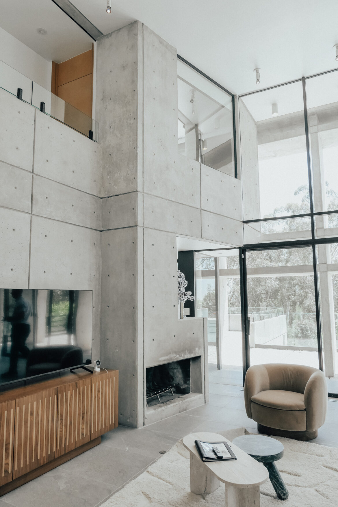
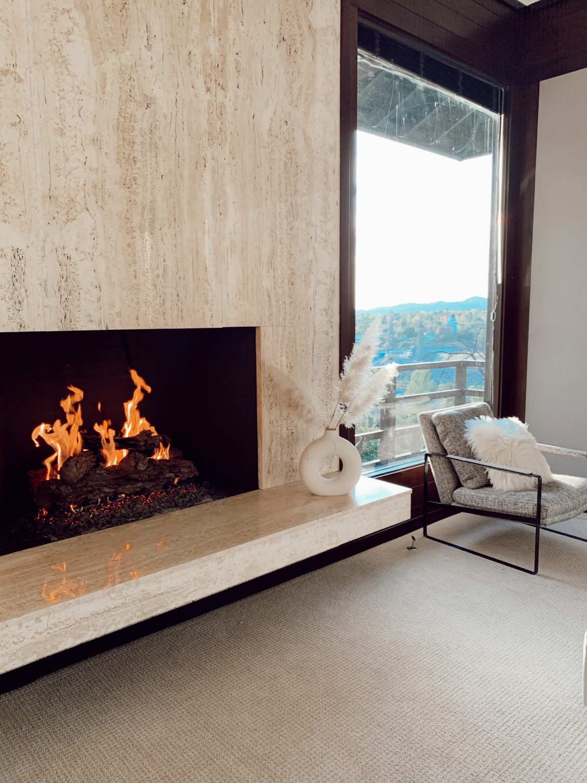
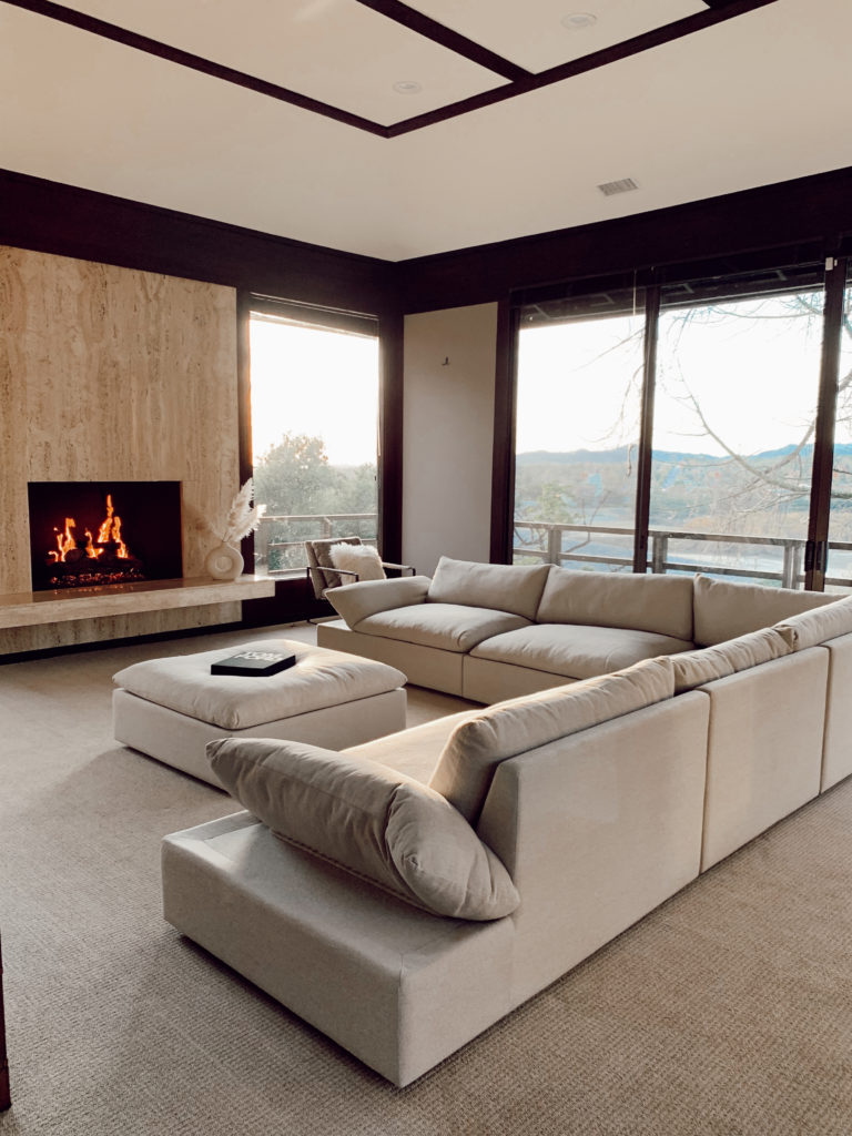
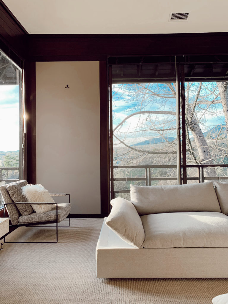
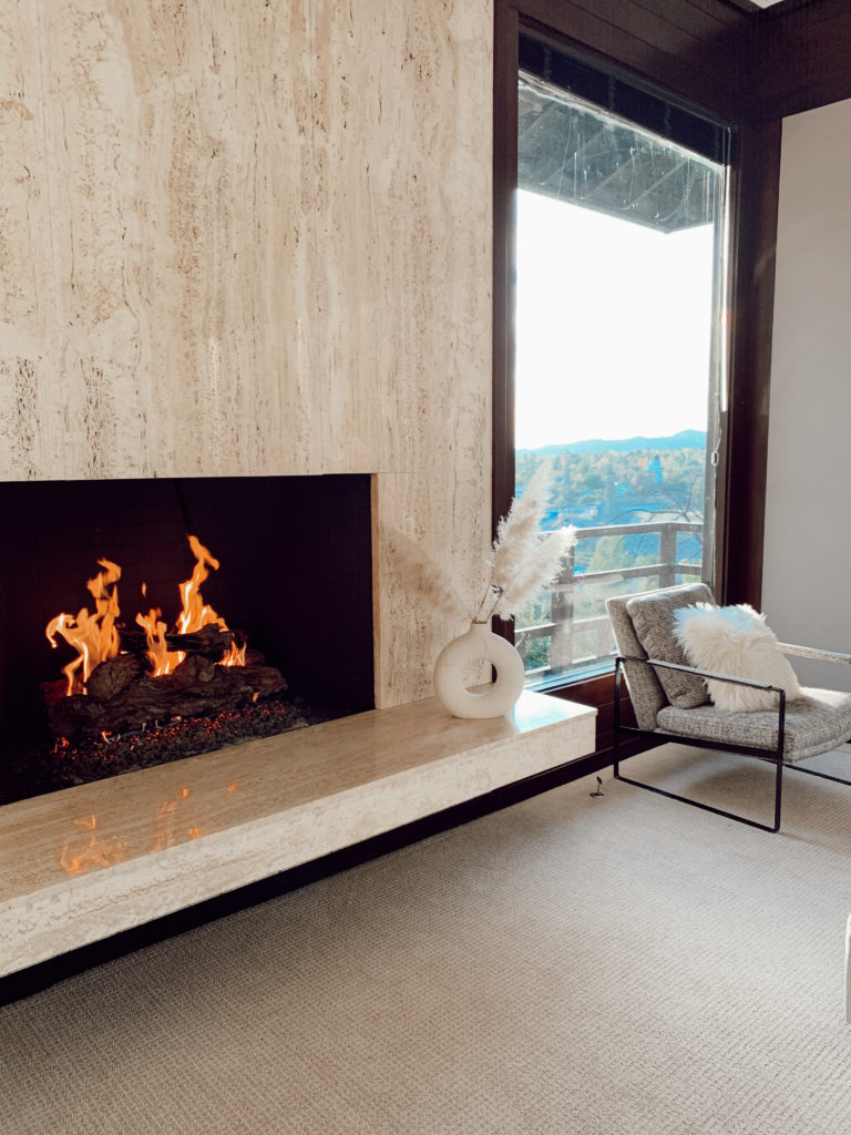
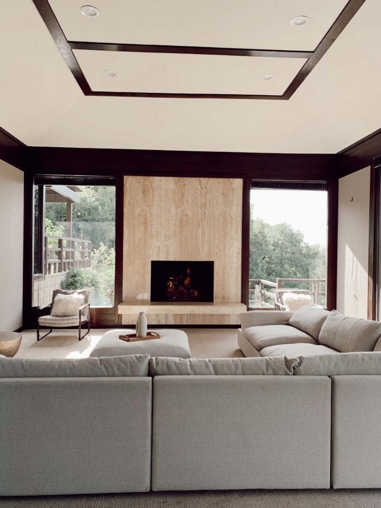
This room gets so much use! Between the office and tv space, we are in here A LOT.

Family Room:

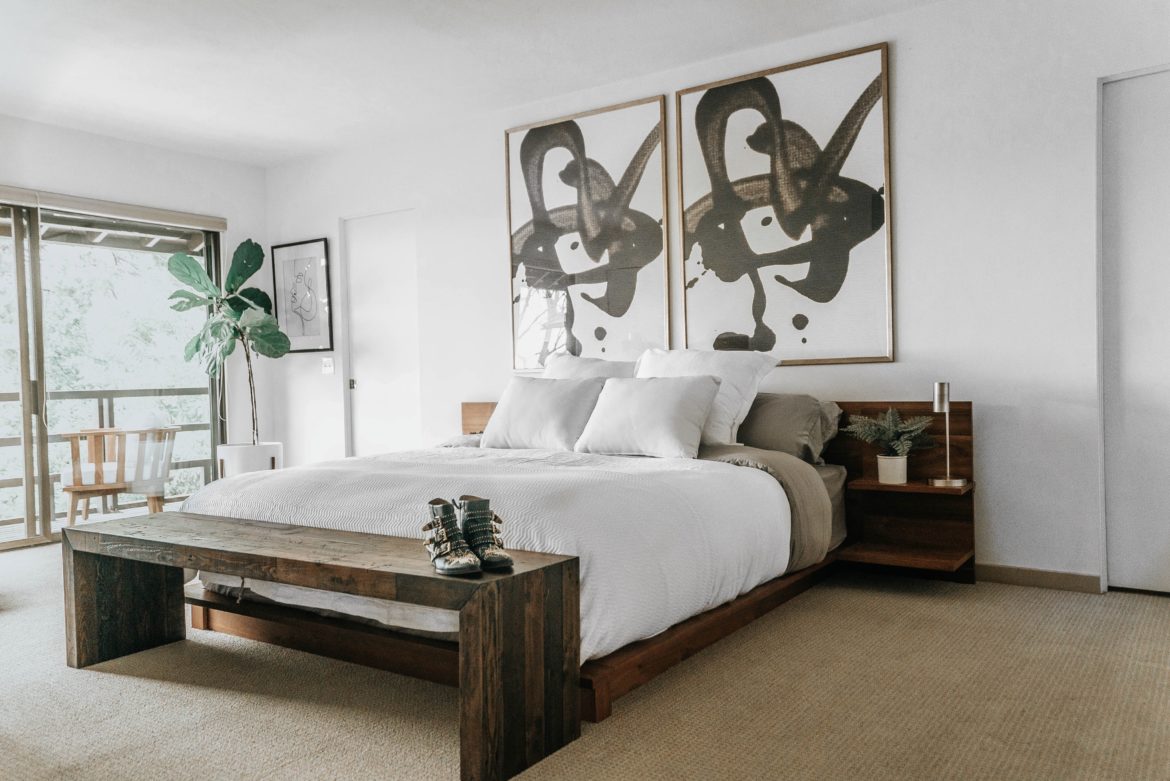
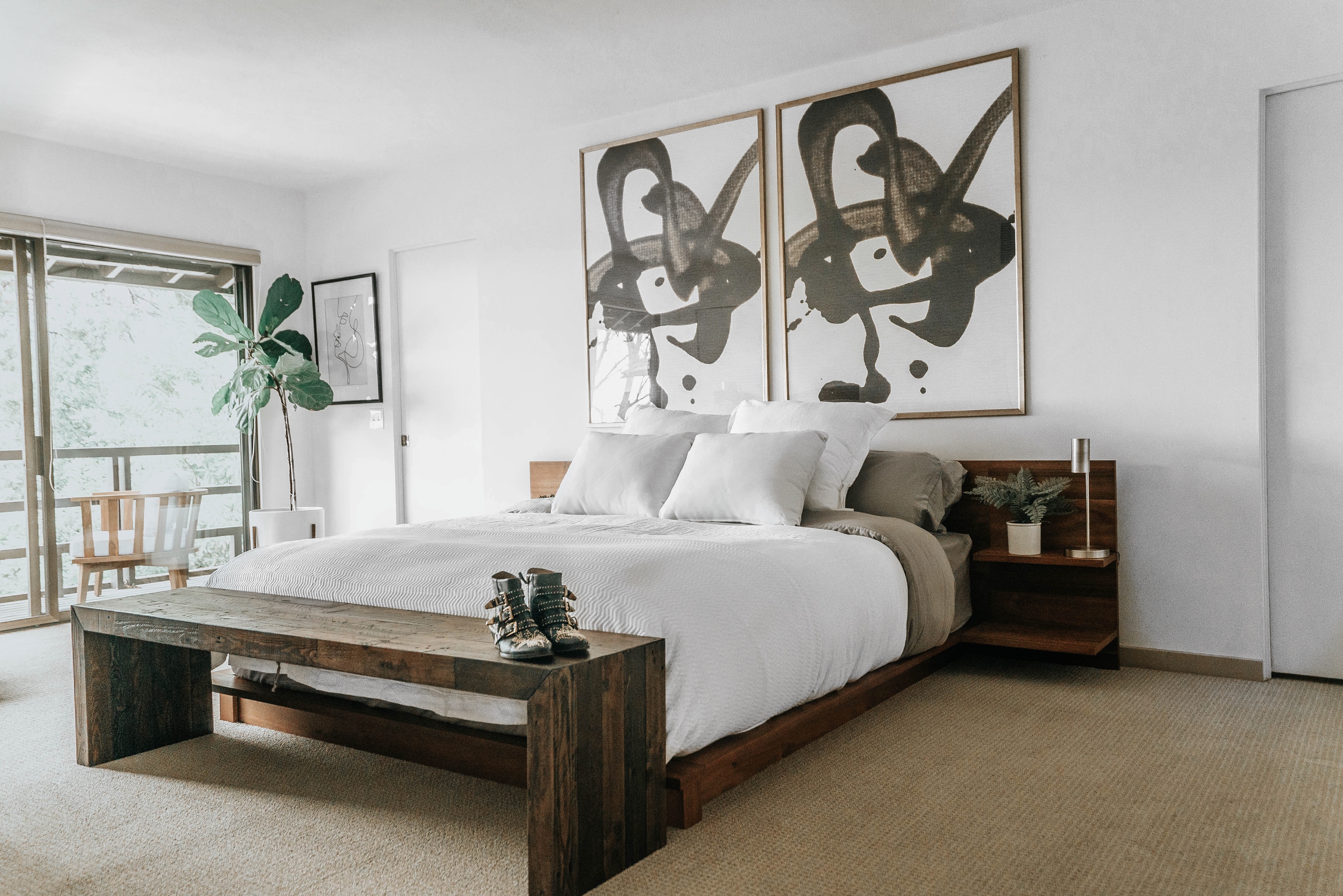
Master Bedroom:

Amazon linen duvet // Sheets // Bed // Small Lamp // Art 40 x 54 // Large throw pillow // Plants // Vase // Down Alternative Duvet // Lacoste Chevron Coverlet // Chloe boot dupes

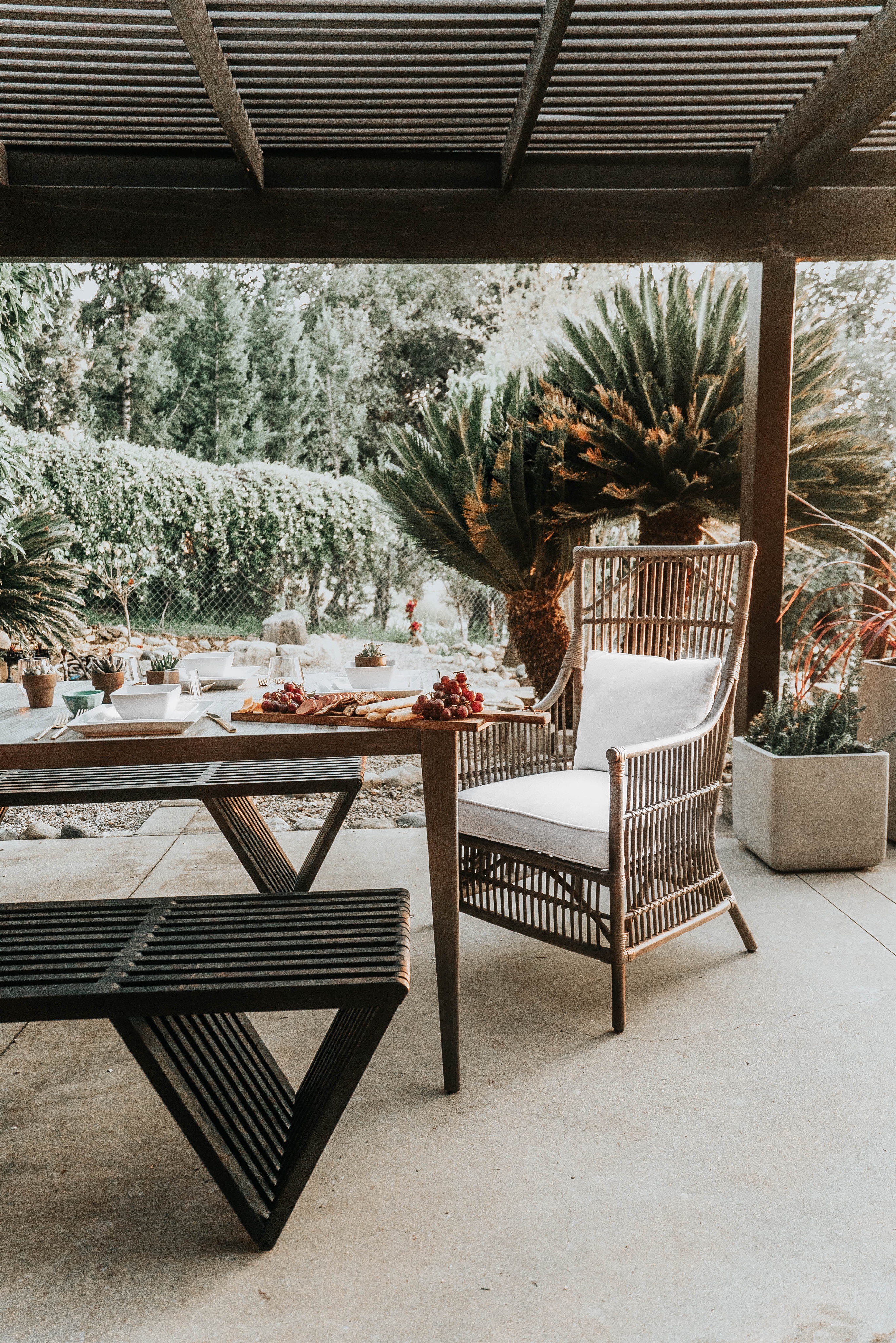
Patio Table and Benches:

Benches in dark gray // Wicker Chair // Square planters


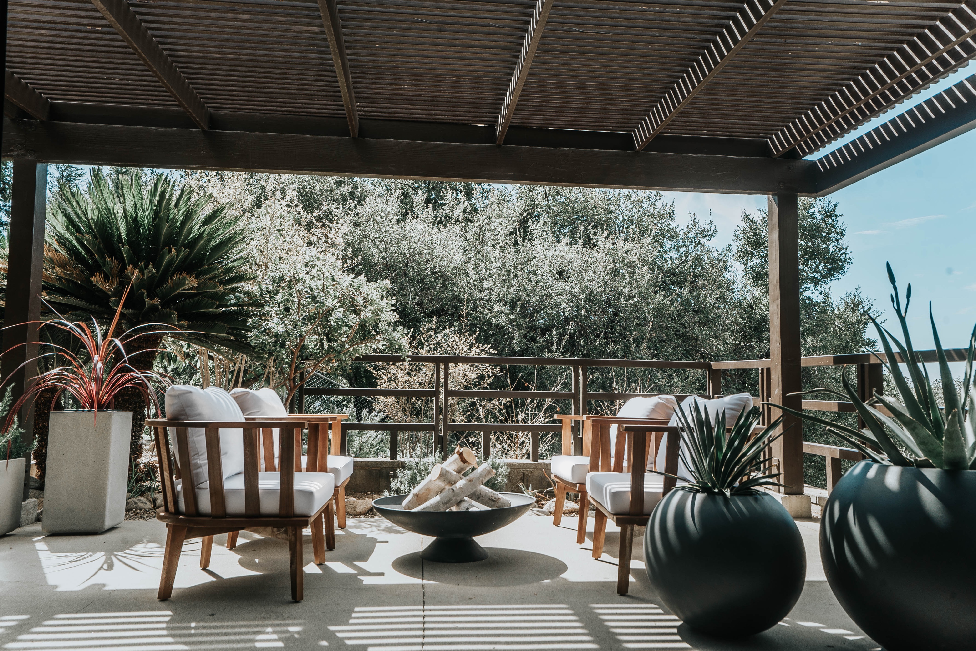
We love our outdoor area

Firepit // Teak Chairs // Sphere planters

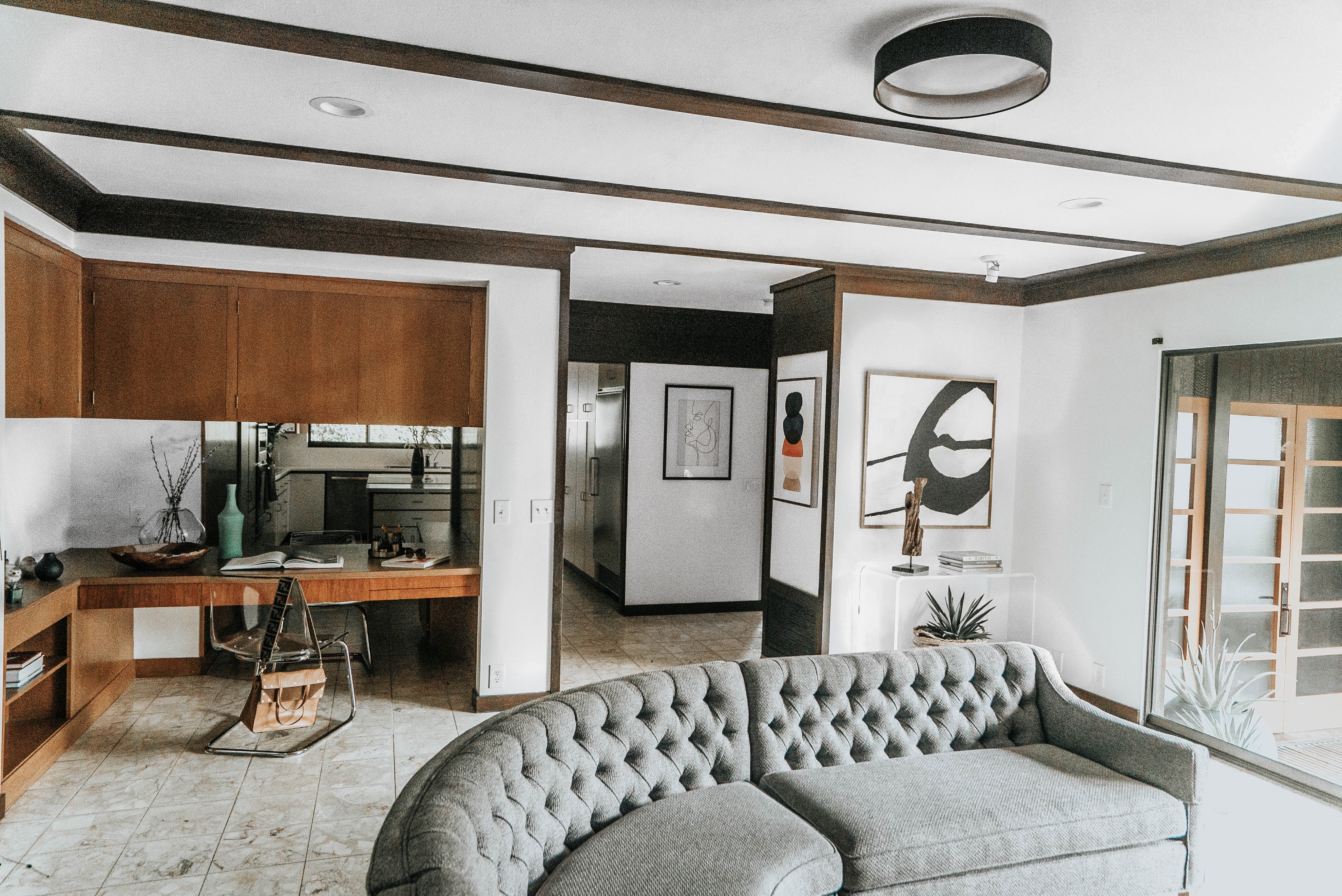
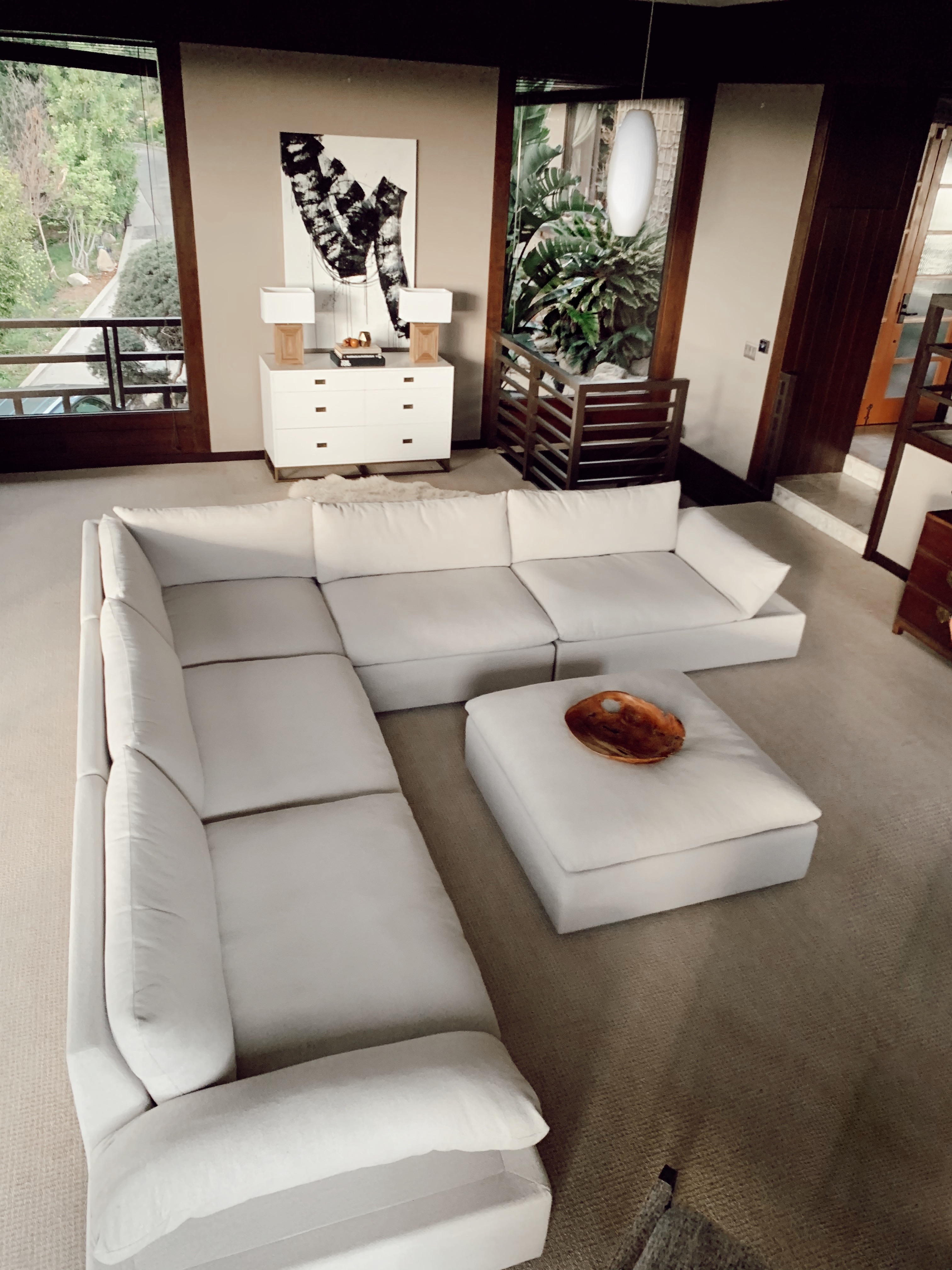
Great Room:

Similar Sofa Sectional // Light // Similar Dresser // Lamps

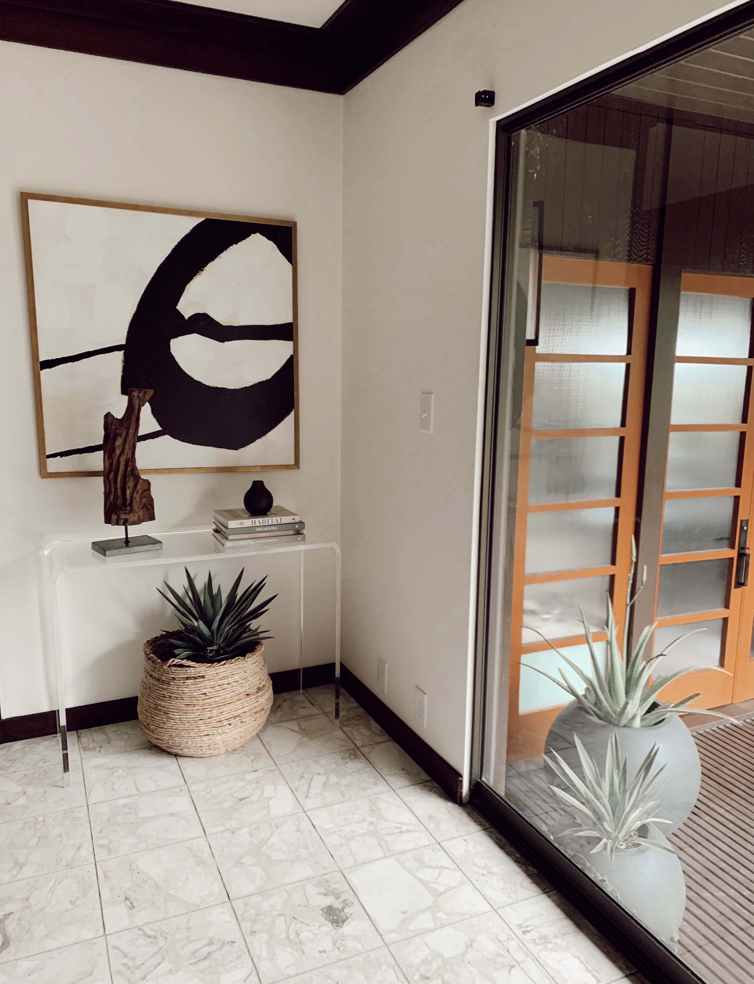
Acrylic Table and Planters

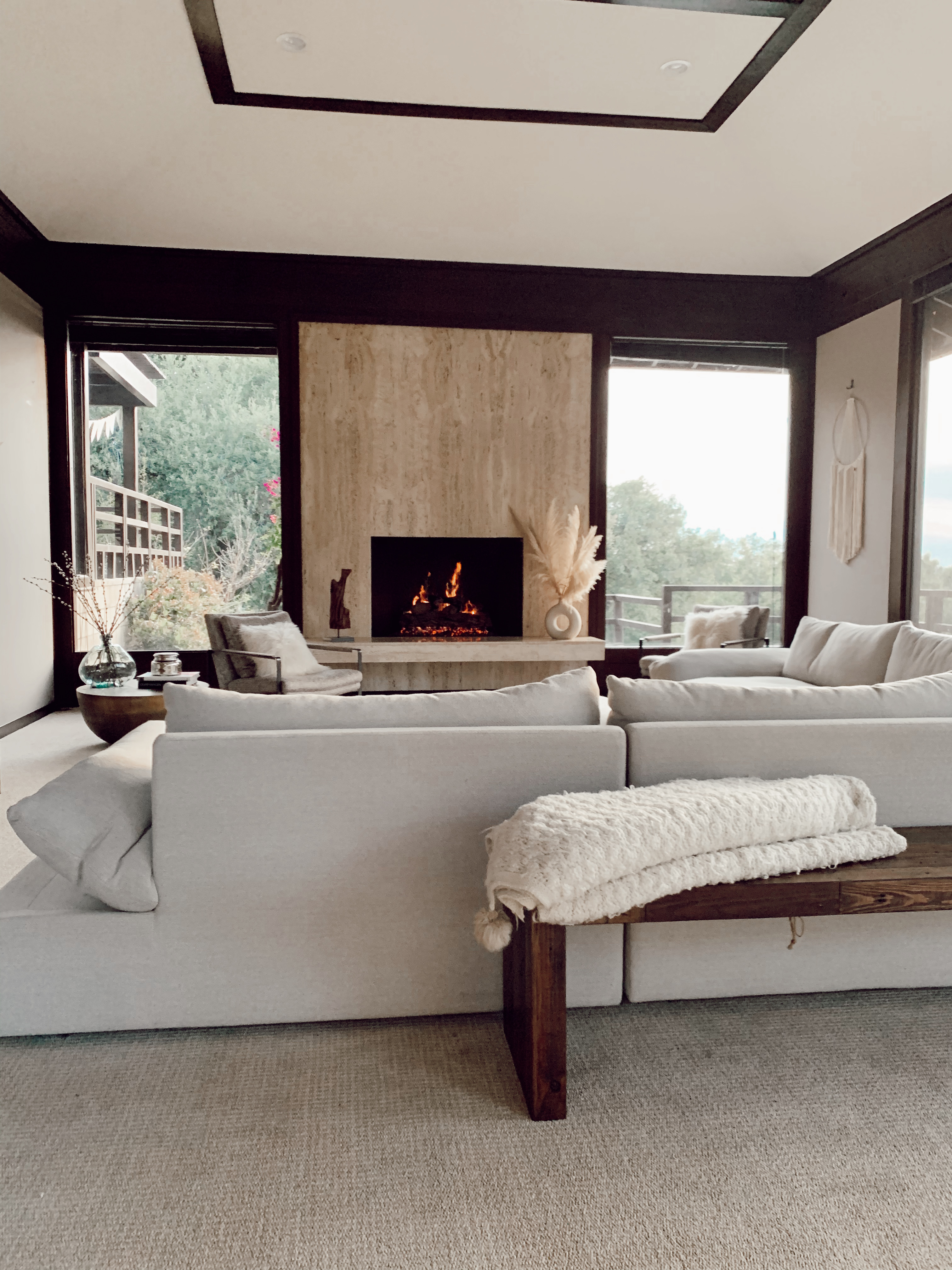
Great room

Similar sectional and larger one here // Dream catcher // Wood Bench // Pampas Grass

I’m writing this the day we sprang forward an hour and the only thing that makes me happy about paying back the hour of sleep we gained last fall is the fact that we now have longer days ahead.  Welcome Spring!  With the coming of later sunsets, we are excited to enjoy time out on the patio of our new home.  This is a first for us.  None of our previous homes had any desirable outdoor space, so we cut new design teeth this season.

               We learned five things while planning our outdoor living space.

1)     Measure your area from deck / concrete edge.  Sketch the area to scale and identify your traffic flow.  Where is the door into your house?

2)     Think design in terms of enjoying from outside as well as inside.  We discovered how much is helps to by similar looking outdoor planters and placing a couple inside our glass sliding door and a pair just outside the sliding door.  We were amazed at how much this brought the outdoors in.

3)     Scale of furniture is everything.  With so many outdoor furniture pieces on the market we were tempted to pick a big wicker looking sectional with coffee table and side chairs.  You can easily buy these as a package deal and it’s definitely a good deal – if you have the area large enough to fill it.  Thankfully, we scaled back a discovered it better to just buy four teak chairs with cushions and arranged them in a circle around a firepit as the coffee table.  (I also might turn the firepit into a planter…just thinking about it.)  Individual seating gives us a lot of flexibility.  We sometimes bring the chairs inside to switch things up.  If we had gone with large furniture pieces, our smaller than anticipated patio would have become crowded.

4)     We steered away from matchy – matchy.  Amazing how fashion parallels interior design.  I found our dining table at CB2, on sale so quickly jumped on it.  It’s durable and heavy which are two things I really liked about it.  However, it didn’t come with chairs.  Buying 8 chairs gets expensive quickly, so we landed on very cool benches that seat six and are stained ebony to coordinate with the grey tones in the table perfectly.  The major win was finding the head of the table chairs.  After researching chair options, I was drawn to bamboo or wicker style to contrast the contemporary design of our table.  We found these grey, high back chairs with white cushions that paired with the table looked dramatic.  Exactly what I wanted.  The high-back chairs gives the large table an intimate dinning experience while the white cushions coordinate with the white cushions on the teak chairs.  (I do bring the cushions in at night to keep them from getting dirty or I suggest covering them)

5)     Lastly, we used small potted plants to finish off the look.  These are reasonably priced to buy a higher quantity and add some additional greenery to your table scape.   Our miniature sedums also add a personal touch at each dinner placing.  Have your guest take one home.

When planning your outdoor space, think scale.  Don’t be afraid to break away from the matchy-matchy pre-assembled furniture sets.  Have fun.  Relax.  Take in the fresh air.  Cheers! 

Keep me posted on your patio life and comment on this post or on my Instagram profile.  I’m still looking for outdoor lighting ideas and thinking about adding a buffet under our kitchen window.  Oh and most importantly, we need a grill so Reid takes on more of the cooking!

Check out my takeover on the Liketoknow.it Home account!

Our sectional: Cantoni Versa Grand Sectional // A cute one that is smaller scale HERE

Not sure if you got the news, but we bought a house!! We didn’t go too far from our rental but loving the new space! We’ve been here for 2 weeks and the sectional we saw in a show room in Irvine is now in our living room. Hooray! While this room is still coming together, it is finally looking like more of our interior design preferences. Reid and I discussed below what are some tips to scoring your next couch. I made a mistake once, buying a sectional online. Once it arrived, I didn’t like the scale of it and it was final sale. I was bummed. Don’t make my mistake. If the brand of couch you like has a local showroom, go ahead and visit it. We had a sectional in mind when we visited the Irvine Cantoni showroom but quickly upon seeing it, we changed our minds. Word of advice: see it in person first. It’s a big purchase, so be picky!

  1. Scale – the couch should fit the scale of the room.  Small spaces are great for mid-century modern looks.  Large spaces are great for big, extra sized sectionals.
  2. Firmness – do you want to sink into the couch and take a nap or have a conversation with some one?  A firm couch is much more formal while a slouchy coach is more restful and casual.
  3. Color – Pick a color that will survive the trends.  I suggest a solid and neutral.  A couch is a big investment and should last you years.
  4. Texture –  For large spaces, don’t be afraid of texture.  Thick woven, suede, ribbed or slouchy velvet.  For smaller spaces, pick smaller scale textures with tighter weave.  Velvet is always a good choice if you can stand the dull vs. shiny marks.
  5. Legs –  For smaller spaces it’s good to have long slender legs .  You want to see the floor running below the couch.  For larger spaces you can pick a couch that has a platform or one that meets the floor.  This gives the couch weight in the large space.

Enjoy shopping around!  Here are my go to couch websites at the moment.

Cantoni, Burke Decor, Rove Concepts, Article

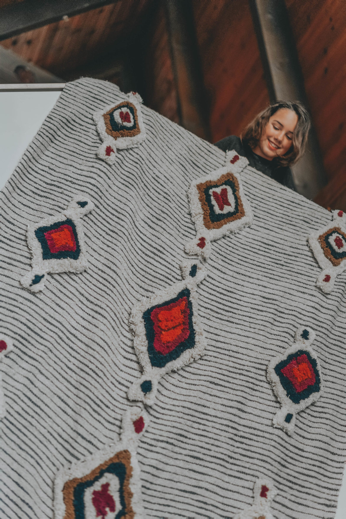
I don’t know about you, but finding home pieces can be SO overwhelming. I’m not a home blogger and know more about where to find the best swimsuit to flatter your body than the best outdoor rug, but I’m learning. And best of all, what helps me to filter through the thousands of inspiration boards on Pinterest, a million sconces, and all the vintage rug goodness on Etsy, is I know exactly what I like. Through some trial and error shopping for our Lake Arrowhead A Frame, here are some finds too great to not share with you! How good is this art I just ordered off Etsy? Now, I just need a gold 36 x 36 floater frame. What are your faves?

Ayla throw (I love this whole collection) // Sconce (so much bang for the buck) // 6 x 9 Persian Rug // Awesome art on canvas 36 x 24 I also like this one under $200 //How do you like this Cool Honeycomb Shelving


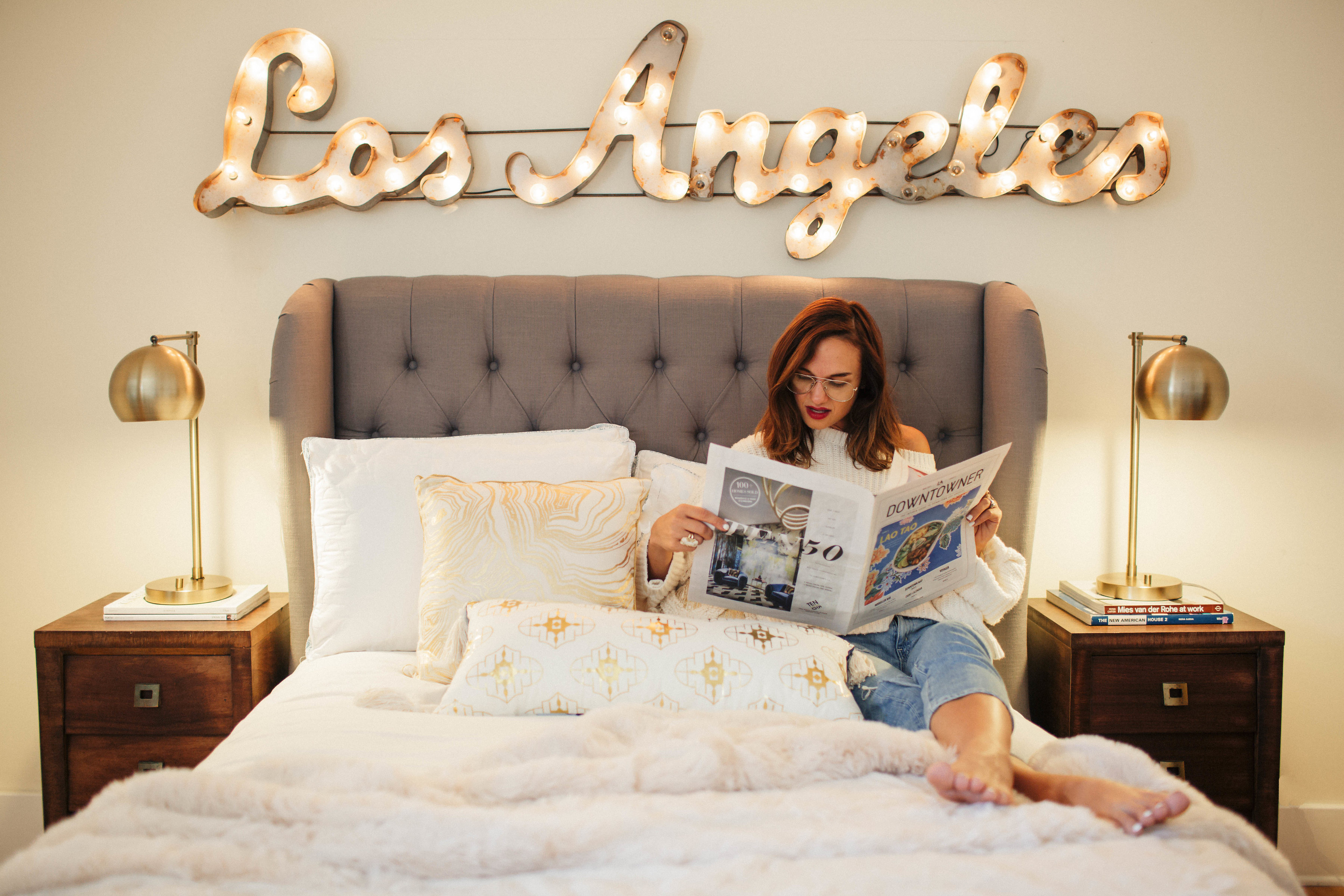
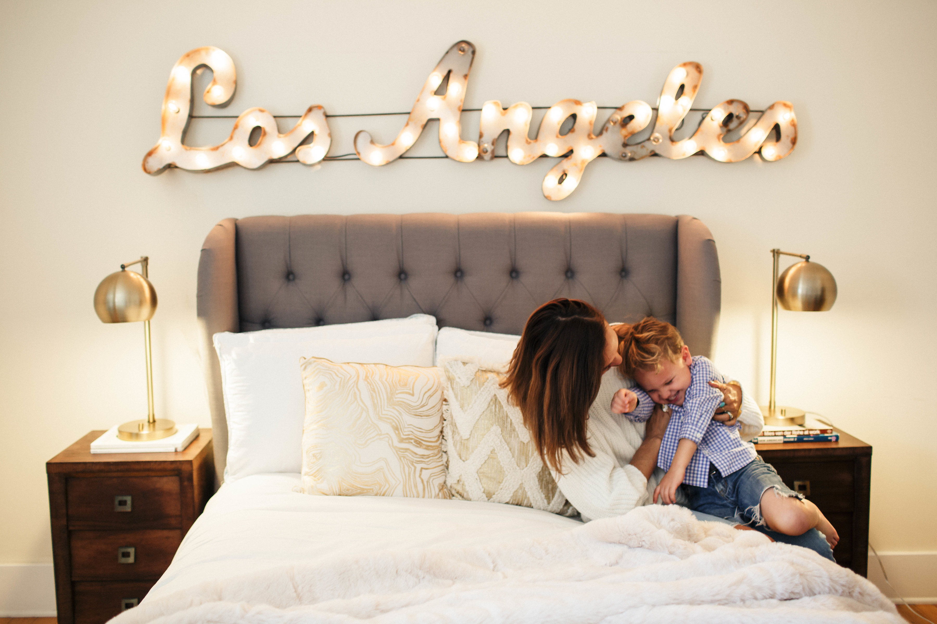
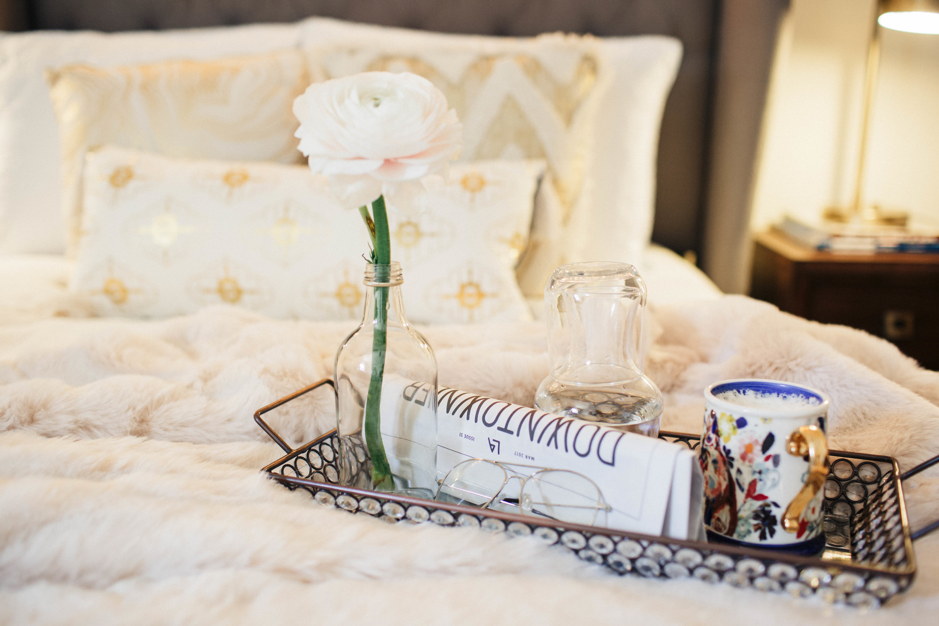
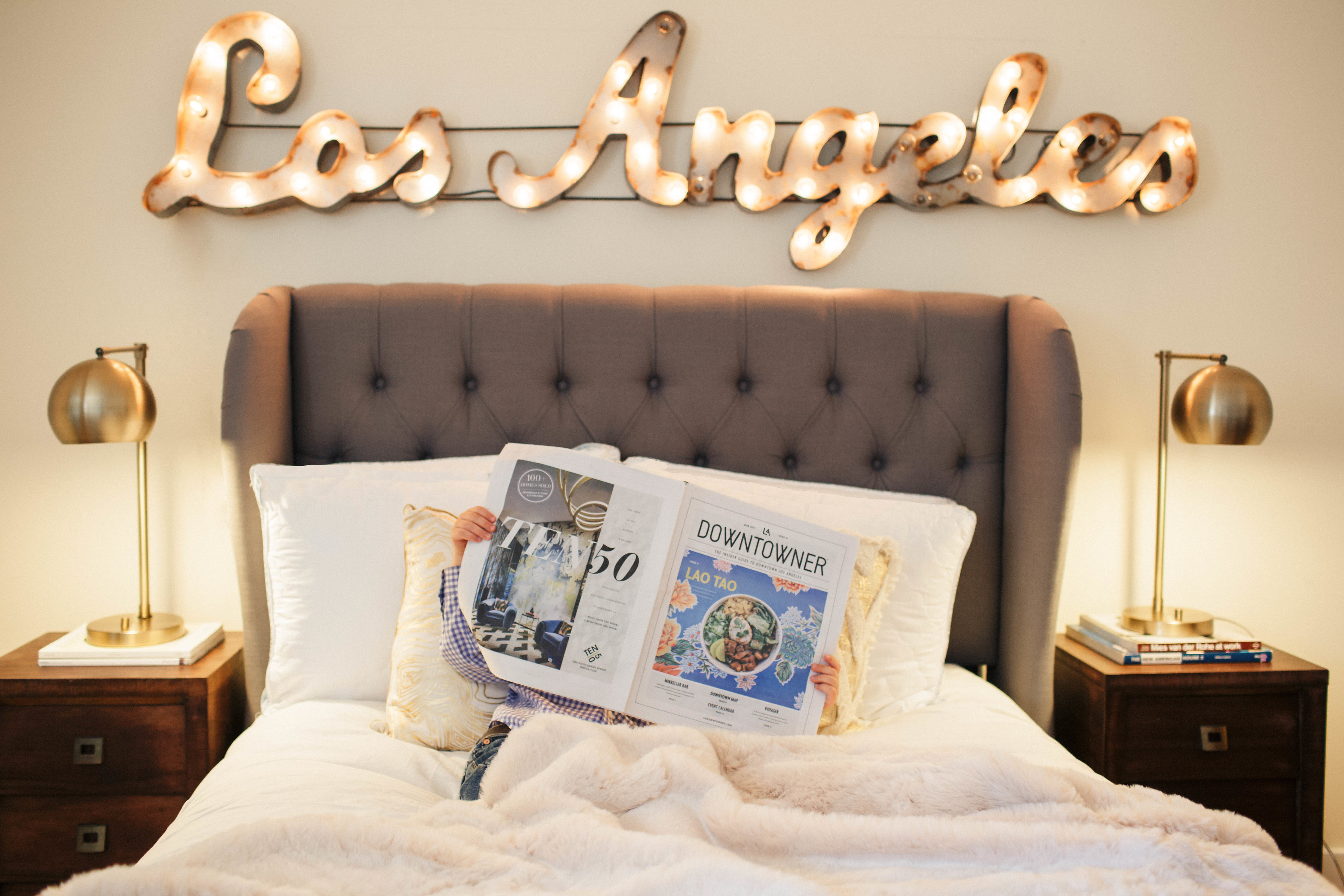
duvet cover :: pillows gold  navy :: lamps :: sign :: headboard similar :: faux fur throw :: mug :: Los Angeles Sign ::

After we moved, our room was the last to get some decorating love. It was the room I dumped everything in, and it swiftly became the least most relaxing room in the house. Enter some new (cheap, so stock up!) white sheets , fresh linen duvet, new pillows, an amazingly soft faux fur throw, vintage bedside tables (hubby refinished) and our vintage Los Angeles sign we brought from the downstairs living room. Violà, a bedroom with more character, simple design upgrades and an incredibly soft bed.

So if you’re a weekend warrior, or comfort queen, here are 3 under $100 bedroom must-haves to make any weekend a holiday weekend (not including Netflix or Nutella).

1 – 2- 3- 

$68 pillows :: $98 faux fur throw :: $47 lamps (on sale)


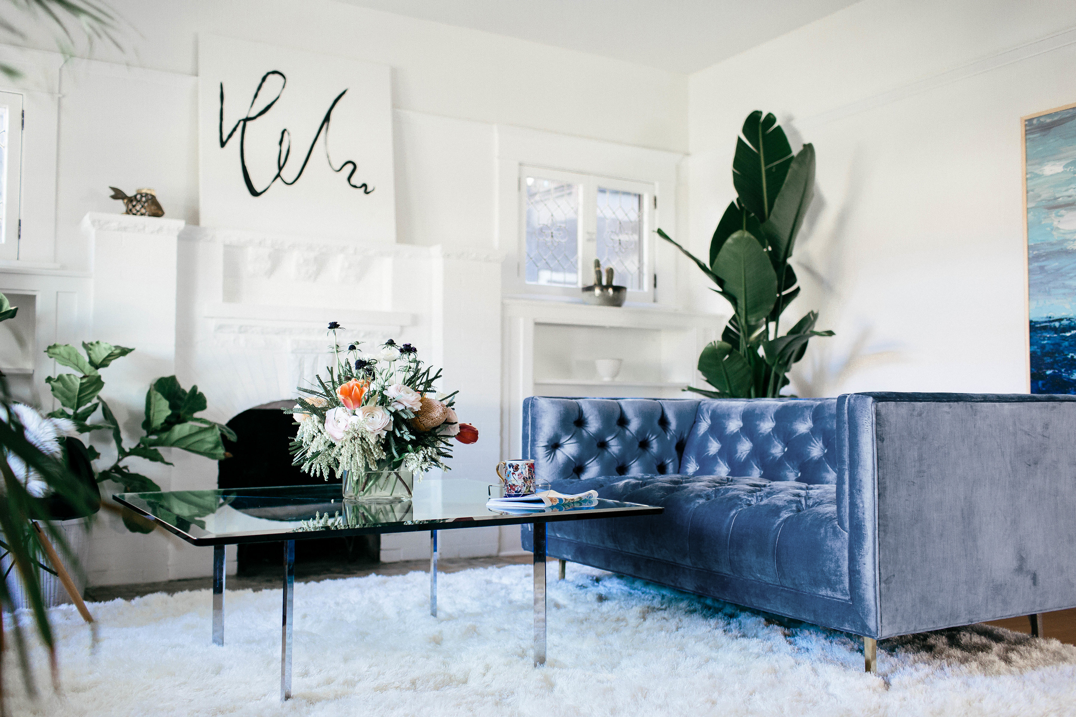
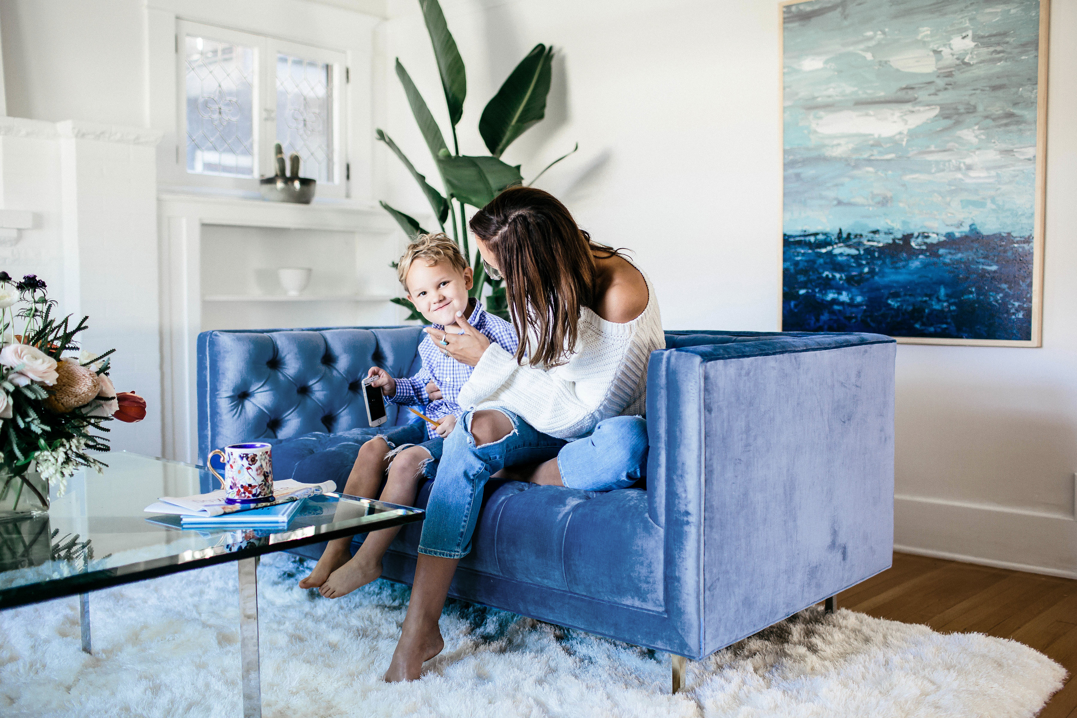
Spring is not just a season to open the windows and air out the house, but a great time to refresh your favorite room in the house.  Reid and I collaborated with Anthropologie Home to give our living room a fresh new look and feel with a few minor and major changes. Here is what we did.

1. We de-cluttered the entire room and got rid of old and unread books. This is a good first step for everyone.

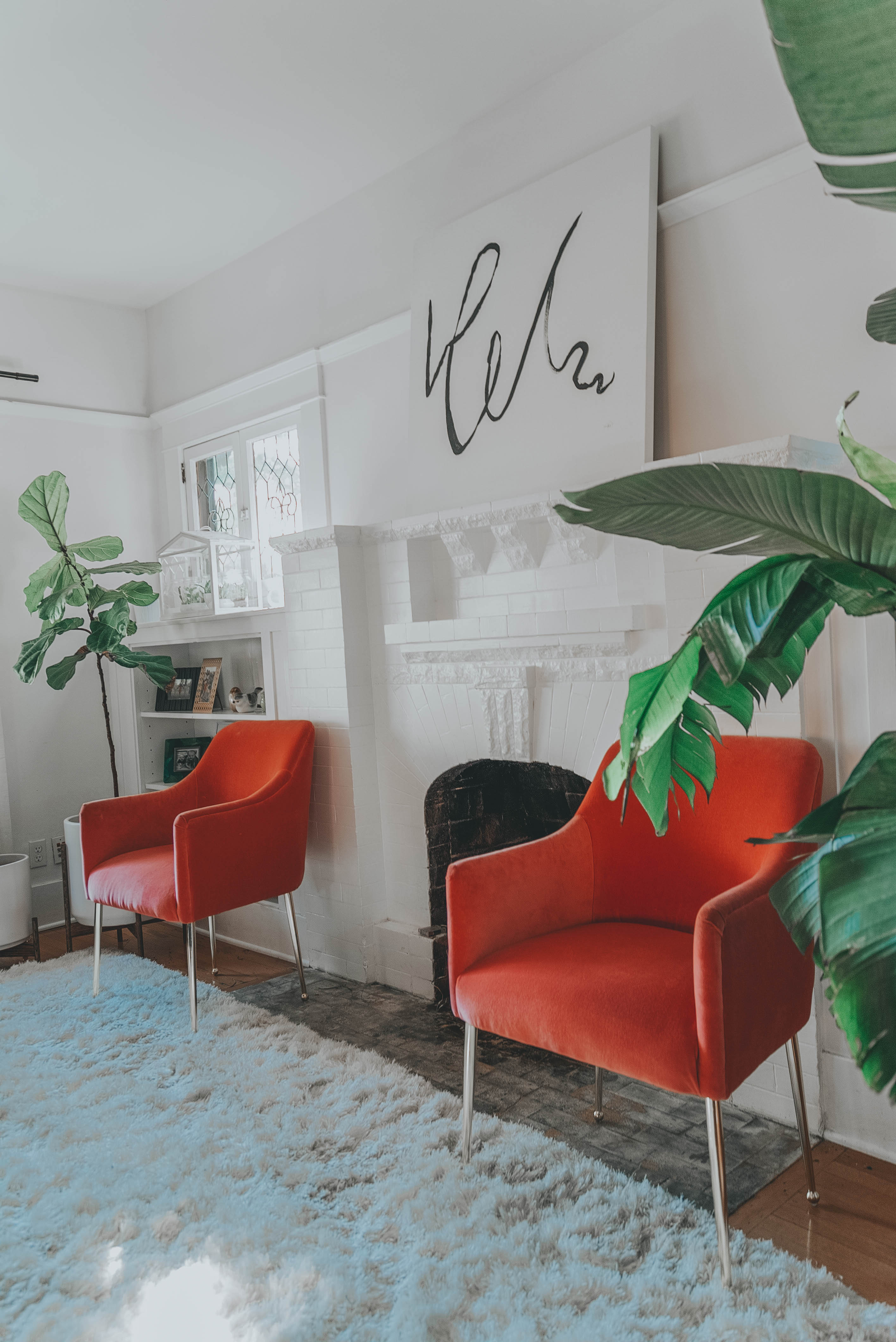
2. We changed the living room paint color from a yellowish tan to a crisp white. Paint is your best friend! If you’re on a budget, start with paint. Be very careful when choosing white paint though; know your lighting and color tone. You don’t want to end up with sterile.  We have found Benjamin Moore’s Decorator White to be a great, versatile white.  See how the artwork and furniture pop!

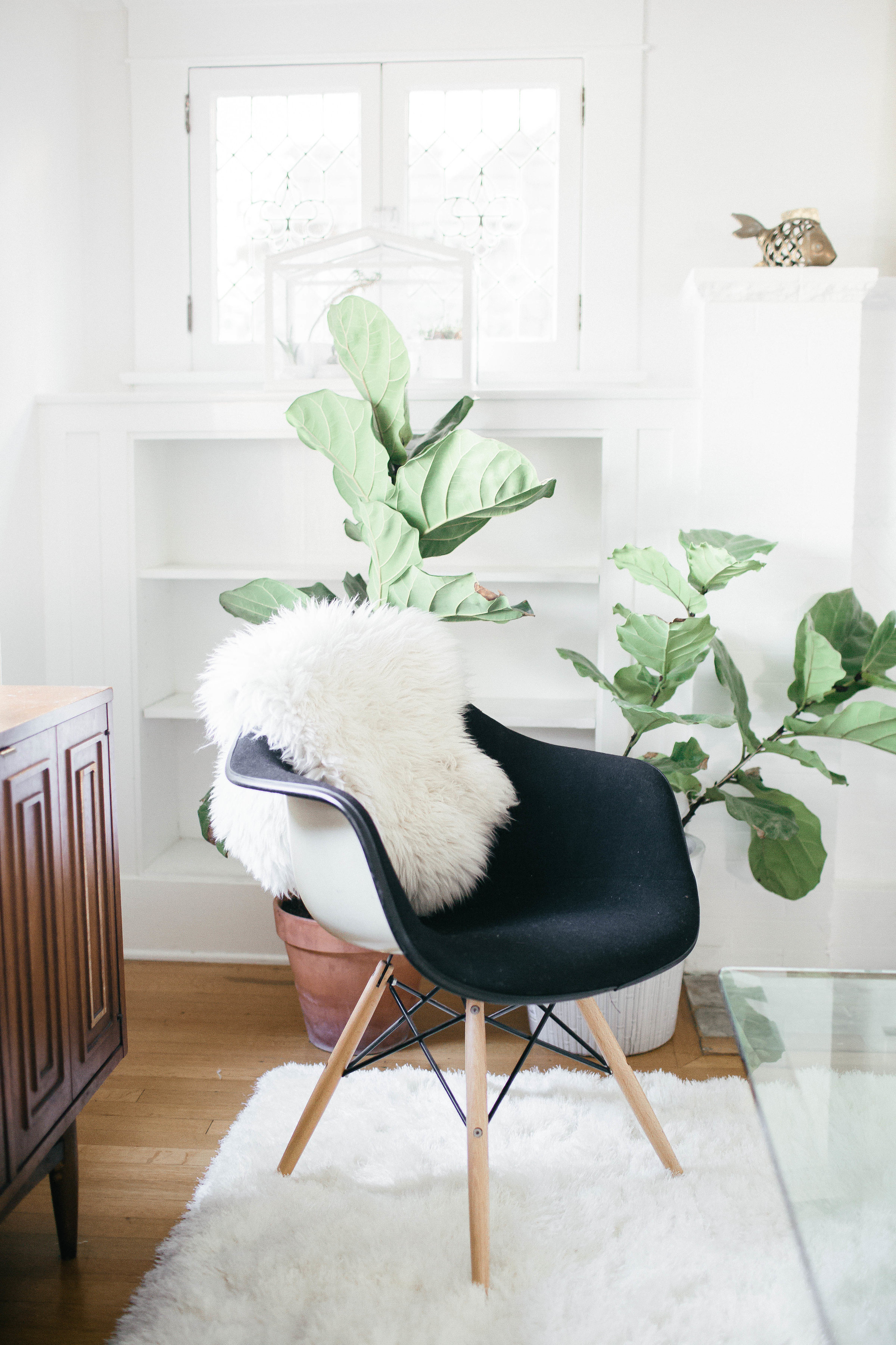
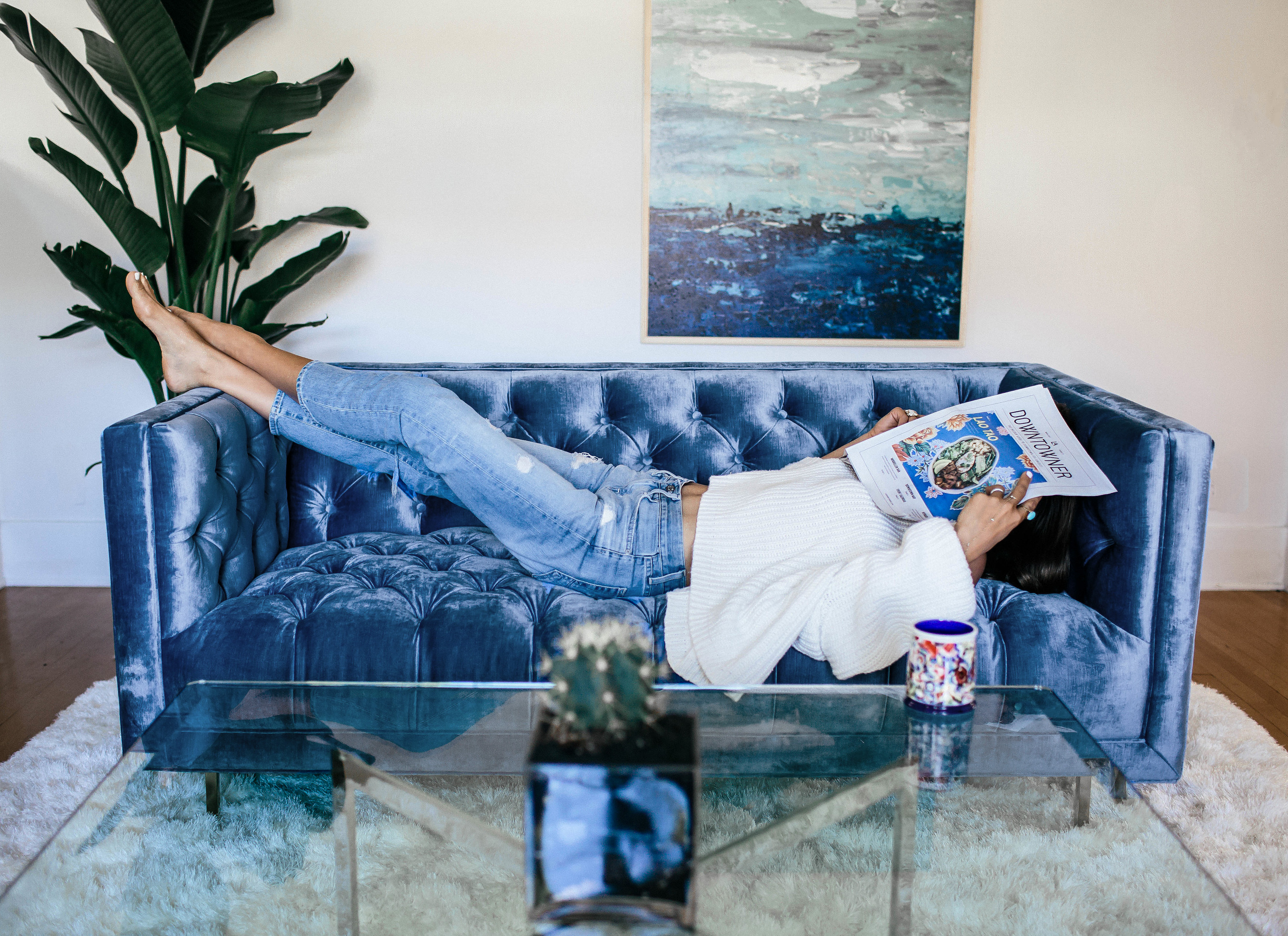
3. We then created a mood board with all the furniture and accessories we have and want. Consider ALL your furniture too, not just the furniture currently in the living room. Switching furniture from other rooms in the house is another cheap design trick.  Let the room evolve and repurpose unexpected pieces in your space, and if you can, add one major statement piece. We added the Anthropologie blue slub velvet couch, which not only became the statement piece for the entire room, but it anchored the look and design.  It is decadent and sleek as you might imagine; the selection in Anthropologie’s home collection is surprisingly large. We chose a settee so that we could float the couch in the center of the room.We moved our vintage sectional into our TV room, which is much better for watching movies as a family.

A. We relocated our mid century credenza to be under the picture window.

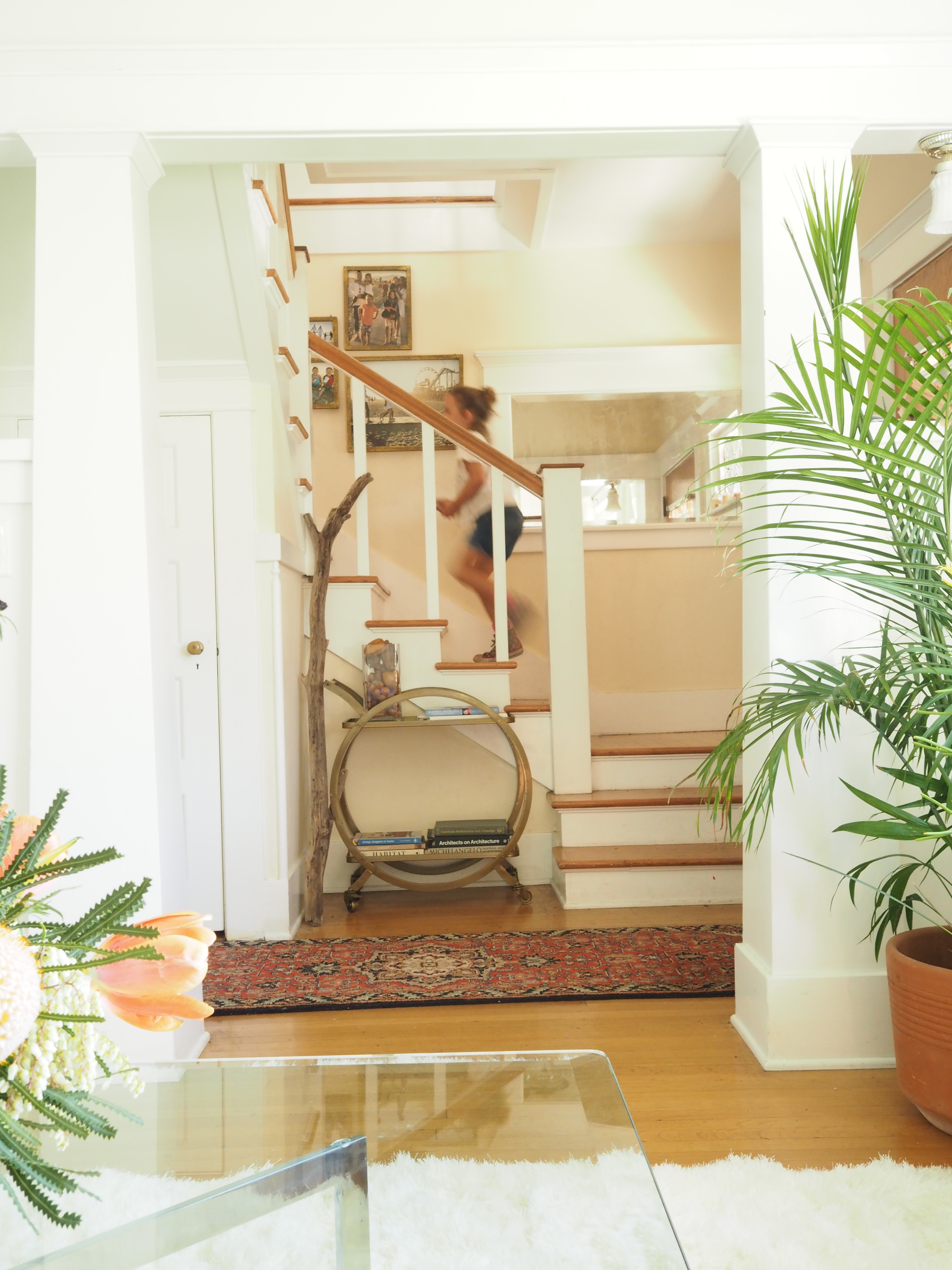
B. We moved our bar cart from the dinning room to the entry foyer.  I love how it gives a whole new purpose to the bar cart.  Now it’s a place to leave our keys.  Plus, we don’t drink (that much) anyway!  It’s better for displaying pretty books and keys.

4. We added new artwork to the fresh white walls and moved our beloved Los Angeles sign to the bedroom.  A few years ago we started the tradition of gifting artwork for our wedding anniversary.  Last year was the Los Angeles sign and this year is the ocean painting from Anthropologie.  I love how it pulls the slush velvet blues from the couch. Add life to your space, literally, with greenery.  Don’t be afraid to go big.  As long as the branches don’t scratch the ceiling, I say go for it.

5. Lastly, add updated pictures to your frames.  We recently worked on a project with photographer Justin Coit and created a new gallery wall of our favorite family pictures.  The kids love seeing the beach as we go up and down the stairs and through the living room.  The drift wood branch was a souvenir from our most recent beach outing and contrasts the metallic bar cart beautifully.  Plus it give us memories of the beach every time we walk through the front door. Love our refreshed living room!

Thank you Anthropologie for partnering on this post! 

Velvet Slub Couch :: ANTHROPOLOGIE :: Summer sky wall art ANTHROPOLOGIE :: brass frames ANTHROPOLOGIE : settee :: gold pillows ANTHROPOLOGIE ::

my sweater :: jeans :: mug ::

Shop the items by clicking the image below

Order your custom velvet couch here!

Rosemary Citrus Spritzer

2 lemons/2 oranges
4 (4-inch) sprigs fresh rosemary
3/4 cups sugar
1/4 cup honey
Ice
Soda water
Rosemary and lemon for garnish (optional)

Peel off thick strips of zest from 1 lemon.

Juice the lemons and oranges into a liquid measuring cup – you should have about 1 cup of juice. Top off with water if necessary to make 1 cup. Combine zest, juice, rosemary, sugar, and honey in a saucepan over medium heat. Boil for 1 minute, stirring constantly to dissolve the sugars. Remove from heat and let sit 10 minutes. Strain, discard solids, and let syrup cool completely. To serve, fill an 8-ounce glass halfway with ice cubes, add 2-3 tablespoons syrup, fill with soda water, and stir. Garnish with rosemary sprigs and/or lemon slices, if desired.

Lavender Mocktail

Ice

3 ounces fresh grapefruit juice

3/4 ounce Lavender Syrup

2 ounces chilled club soda

1 basil sprig

1 fresh lavender sprig (optional)

1/4 ounce grenadine, preferably homemade

Pomegranate Mocktail

2 cups pomegranate juice

2 cups ice cubes, or more if needed

2 tbsp fresh lime juice

1 tbsp orange blossom water

Sweetener to taste

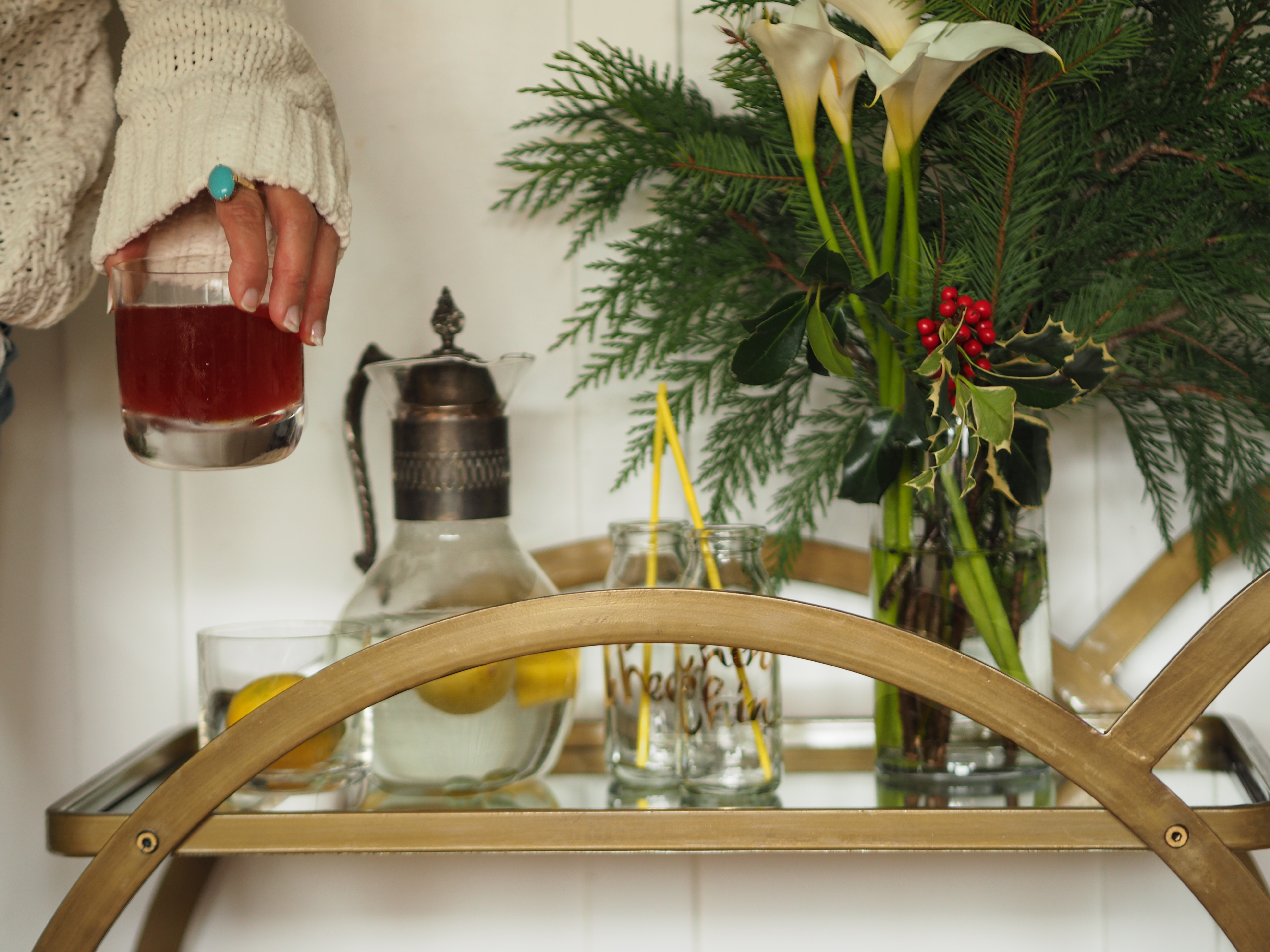
Whether you’re hosting or attending, I’m loving a refreshing mocktail after a busy day. And how great is this bar cart? I’m having fun styling it for the holidays and can’t wait to host more parties in 2017 at our place. Look for more home posts! Hope you all had a restful weekend. xx


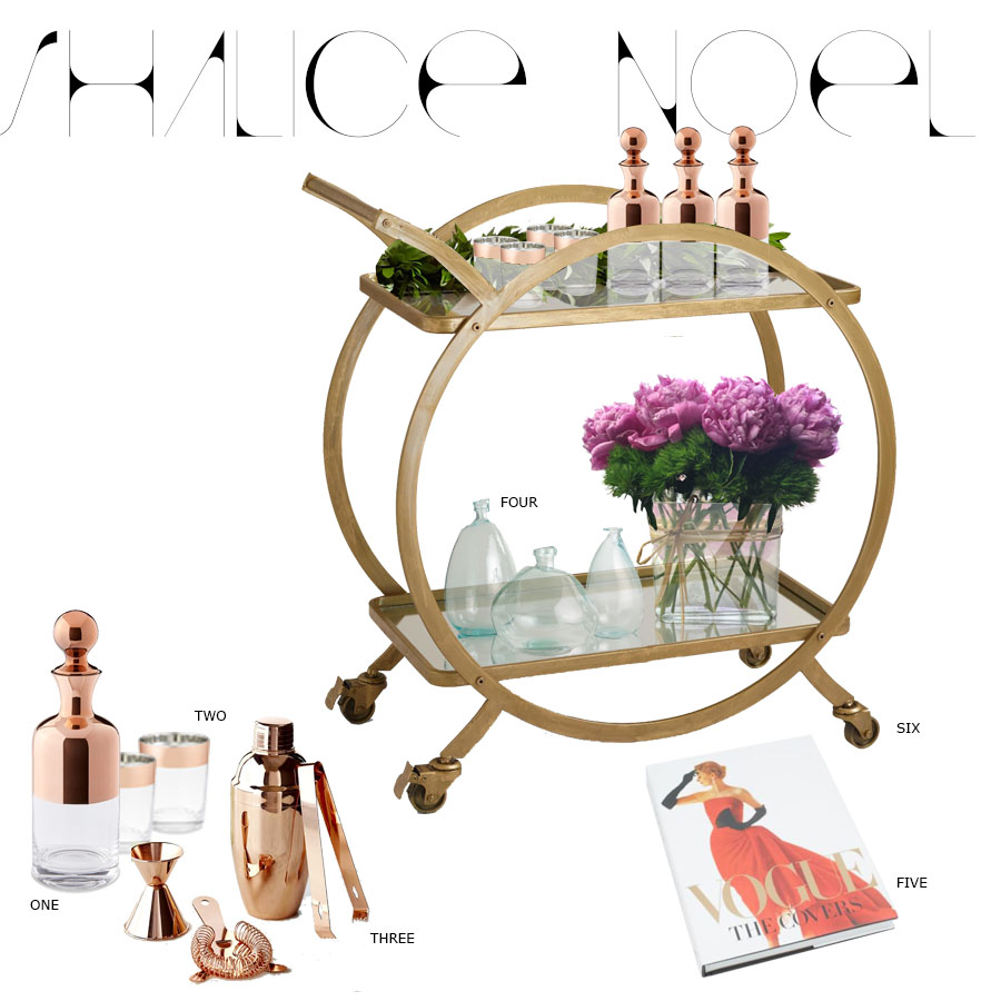
BAR CART use code HOLLYJOLLY for 10% off and Free Shipping order by 12/12 to get it by Christmas //  VASES // BOOK // BAY LEAF GARLAND // DECANTER // GLASSES // BAR TOOLS