Tag:

A Frame

Why We Sold Arrowhead

by Shalice Noel

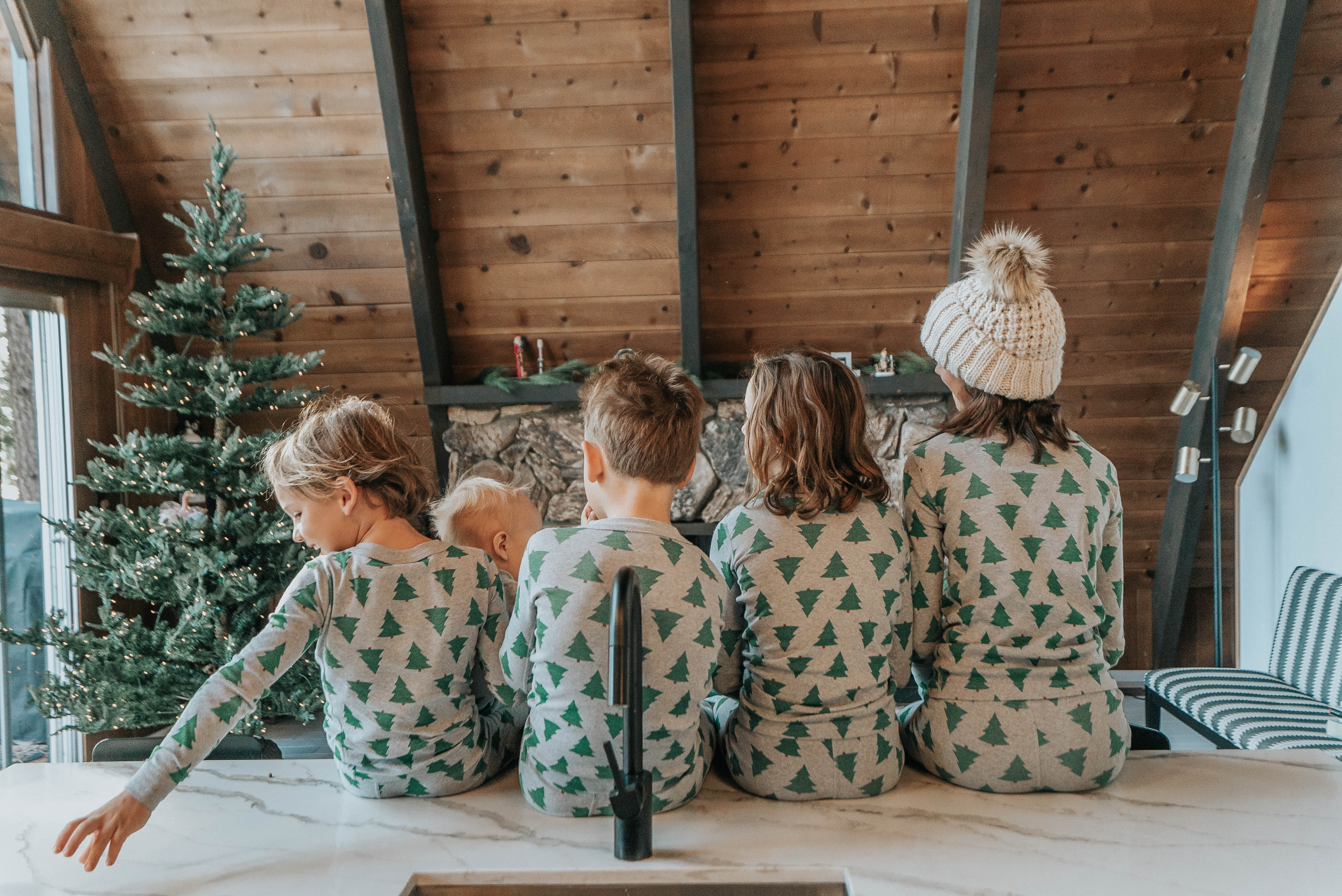
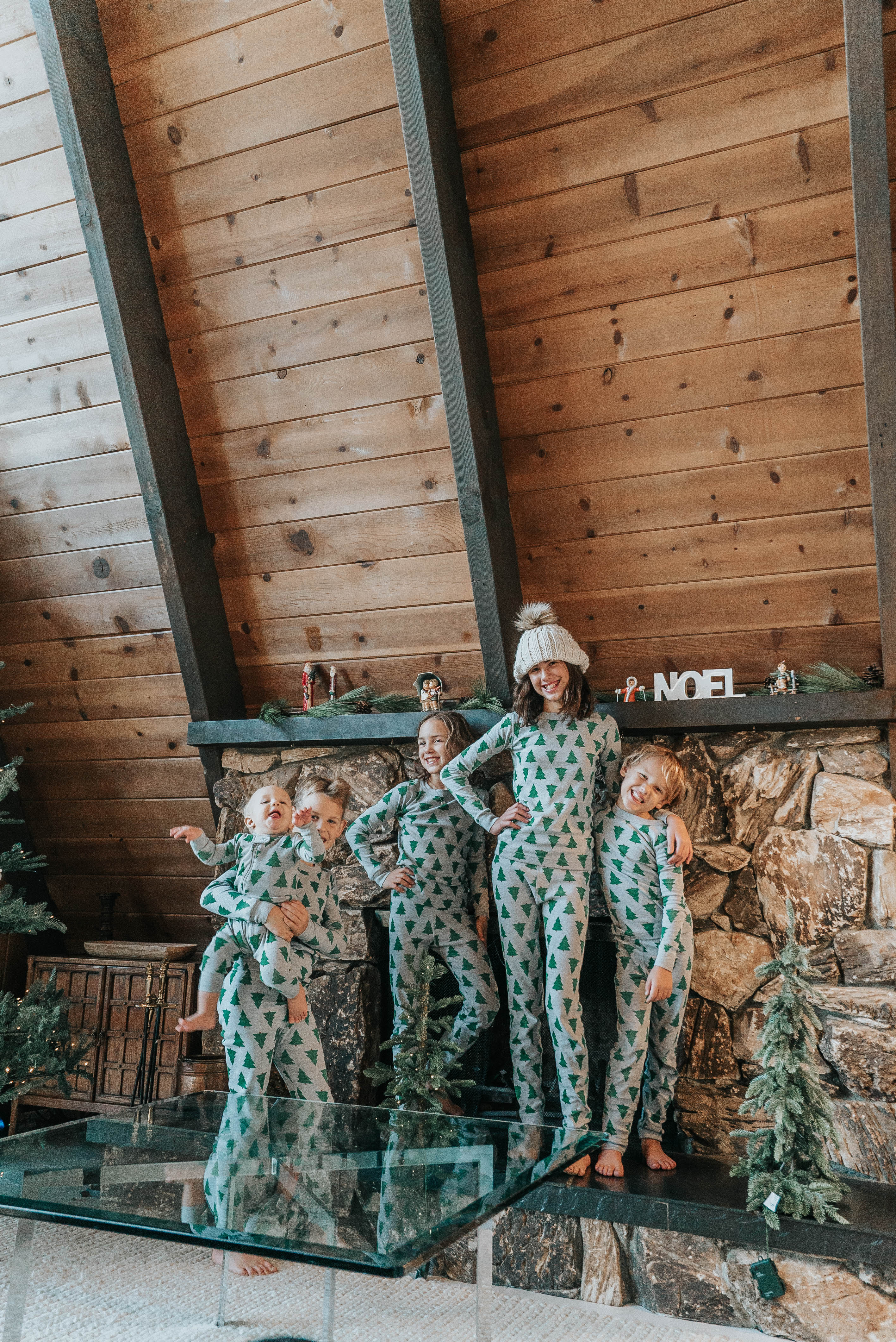
Our pj’s are on sale!

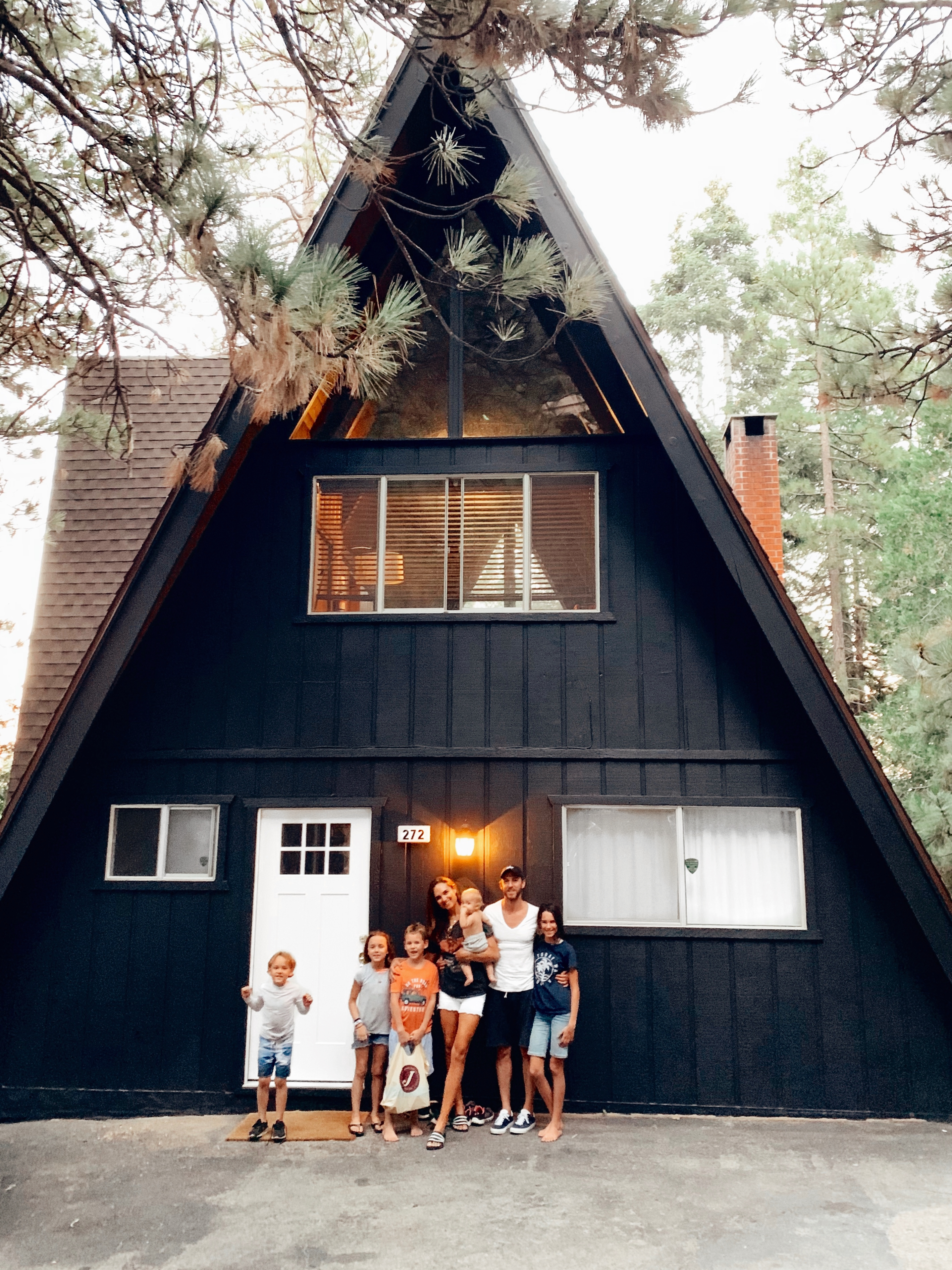
12.16.19 We closed on our beloved arrowhead home.

When we moved from Chicago to LA, we anticipated giving up the opportunity for homeownership. We knew it would be crazy out here, so we decided to rent until we really knew the area. While renting, we were longing to sink our teeth into a house. We looked for houses all over, made offers, waited and prayed. The doors kept closing. 

Out of frustration, we decided to rethink homeownership. There are many benefits to renting, but wow, we really wanted to sink our teeth into a house. That’s when we made a unique decision. We decided to buy a cabin in the mountains with the potential to rent it out. Reid was once told, “rent where you live and rent what you own.” As Reid obsessively searched the real estate listings in Lake Arrowhead, he finally came across some doable options. Our A-Frame was a diamond in the rough and we knew it had SO much potential. We leaped on it and didn’t turn back. After 6 months of design and countless trips up and down the mountain, the place looked pretty special and we loved it. 

How did we find the A-Frame?

Reid kept his eye on the real estate listings for Big Bear and Lake Arrowhead. I think he looked at every house listed for a month straight. We knew how much we were willing to spend and we did our research and looked at Airbnb listings to find daily rates and how often they booked. That way we knew if we rented the A-Frame for a minimum of 10 nights a month we would cover our cost. It’s all about timing and seeing potential in what seems unlikely – don’t be afraid to jump on something you don’t exactly want. 

What did you learn from renting it out?

Renting the A-Frame on Airbnb was a great experience and helped offset our remodel expenses. Our guests were super polite and we received great comments. Although, of course, there was one funny thing that happened in our year of short-term renting. Our oven knob kept braking. We have no idea why, but we went through four knobs in two months! Reid finally made a video of how to turn the oven on and would text it to the guest when they arrived. That seemed to do the trick.

The grand finale of our rental was the 24” snowstorm over Thanksgiving of 2019. Our guests lost power for the entire day, ran out of firewood and their phones died. Needless to say, they loved their snowed-in experience and their kids thought we “staged” the snow. A great ending to a year of hosting guests.

What does it take to be an Airbnb Superhost?

Communicate clearly

Touch base with the renters, but don’t act like you are babysitting them.

Make your guests feel welcome

Clean

Comfy beds (thanks Lull Mattress! We got so many compliments on our comfy mattresses)

Respond quickly

Why did you sell?

The decision to sell was easy for me but hard for Reid. While I loved going up to the mountains as an escape from the LA grind, I still found the trip exhausting. Packing the family up for a couple nights was a lot of work. The kids also started soccer and our free weekends became not so free. We found it more difficult to spend time up there. I decided I would rather invest in our primary home. I wanted a house we could live in, design and make a home. Reid, on the other hand, was a little more emotionally attached. This was his vision and a great experience for him to see his drawings come to life. He loved the quiet of the mountains and the architecture of the A-Frame. But in the end, we both agreed that we would rather have a permanent home of our own. Thus, we decided to list the A-Frame on the MLS with Christine Williams who was referred to me by a friend. 

With the sale of Arrowhead, we were able to have a down payment for our new house and super thankful. While we are sad to see it go, we are overjoyed for the lasting memories we made there.

See more about the renovation, inspiration, and links to products we use, HERE.
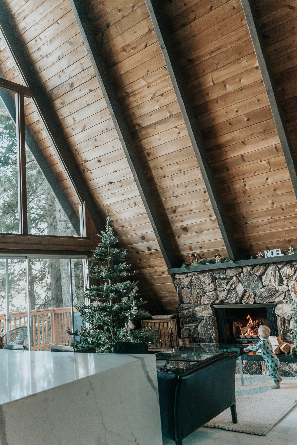
Runner Rug from Etsy shown above // Here’s one similar // Pjs // I have another runner by the front door by New England Loom

I’m headed to Calabases to shoot a fun brand, but in the meantime, this is what is on my shop page, and 5 runners I’m loving. I had so many questions where I buy rugs, so here they are! I buy from from Etsy and New England Loom and usually look for a pop of pastel and a great pattern. See some favorites below! I’m craving another slow weekend at Lake Arrowhead. Although it’s hardly slow with 5 kids, the absence of traffic, and need to go anywhere is as slow as it gets. What are your weekend plans?

This is totally random, but I just saw Nuface was having a 40% off their Mini and Gold Gel Primer (I just purchased, shoot!) While I missed the sale, I’m still going to stock up on gel. Hello hydration during a long flight! If you don’t have the mini, it’s a perfect workout for a tired face for traveling or busy mom life. Take my advice. I use it evening and mornings (while I nurse). I figure since I don’t have time for a facial most weeks, I don’t want my skin to feel the brunt of my busy life.

I’m also trying a new no clump mascara, just in time for Anniversary dinner Sunday.

Happy Friday!


While I was attending the rewardstyle conference in Dallas this year, I got to know @Lucyswhims a fellow mom of two and blogger. We quickly bonded over birth stories, rosé and a latte for me along with Erica from @fashionedchicstyling. What a fun bunch! They made the weekend for me THAT much more enjoyable. I recently invited Lucy and her family to stay at our cabin.

She wrote an article on her blog about her family’s stay at our A Frame and what they did in and around Lake Arrowhead Village. Go read it! Read more about our A Frame renovation and what we learned HERE. And the best part? You can book your next stay there as our cabin is finally on Airbnb.
Go check it out and let me know if you have any questions!

Thank you Lucy for these beautiful photos!

 Read Lucy’s post HERE // Rent our place HERE


With 5 beds, candles for the kids teachers and countless throws to buy for the Lake Arrowhead home, you can bet I’m shopping the Nordstrom Anniversary Sale! See my picks below including Duvet covers I tried to find muted ones and printed depending on the room. What do you think?

It has been 5 months since we closed on the A-Frame at Lake Arrowhead and time has flown. As we wrap up the renovations, we’d like to share with you some behind the scenes design decisions we made to get the most bang for our buck. I will say, having an architect for a husband helped immensely. 😉

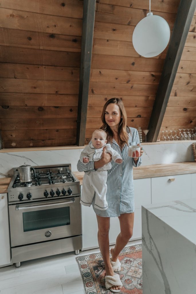
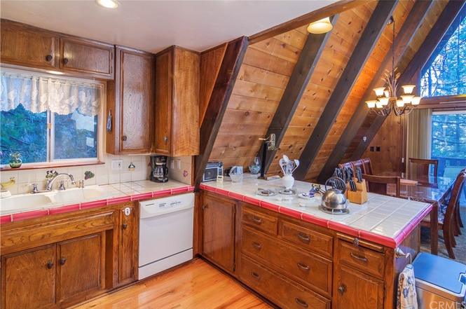
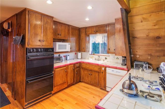
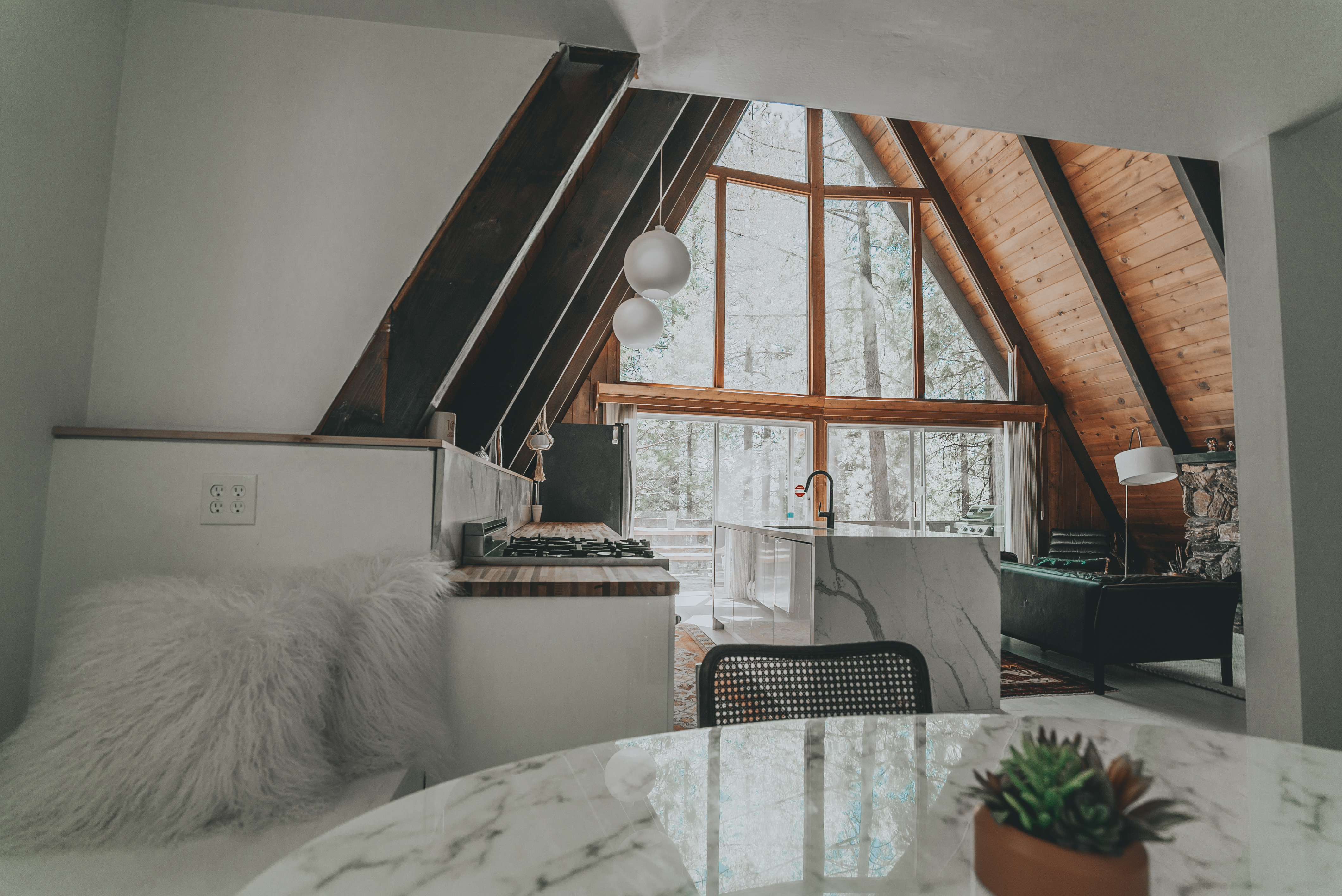
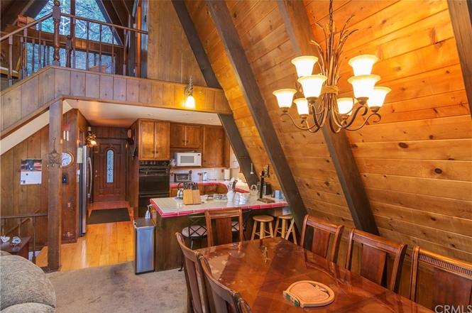
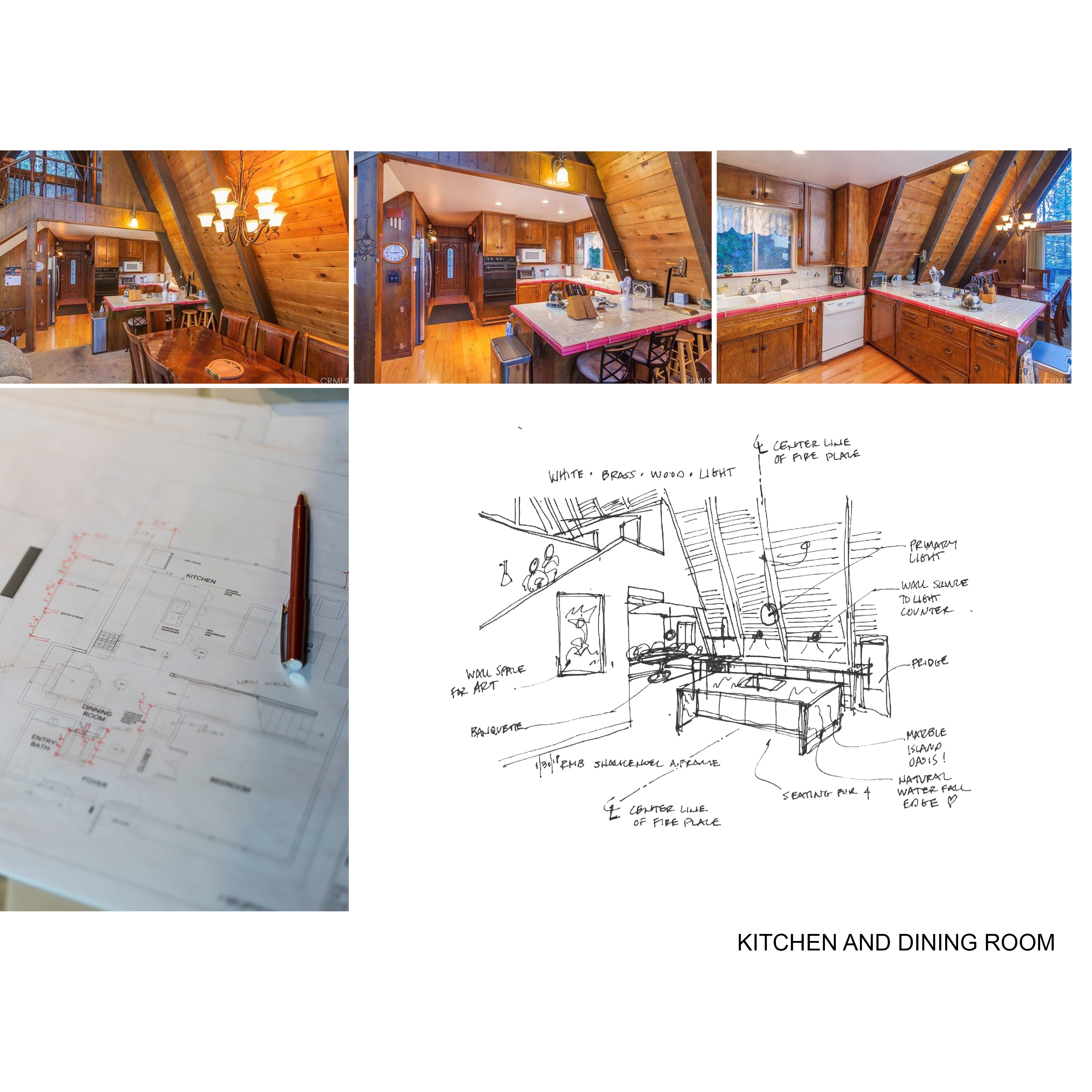
The first room transformation is my favorite—the kitchen. To give you an idea of what we’re working with, the house is a 1969 A-Frame and was built as a summer retreat to beat the southern California heat. The kitchen in the house was dark, drabby and a DIY mish-mash with dirty tile counters and a quirky peninsula. At first, we thought we could just paint the cabinets, but after opening up the doors we knew we had to completely start over.

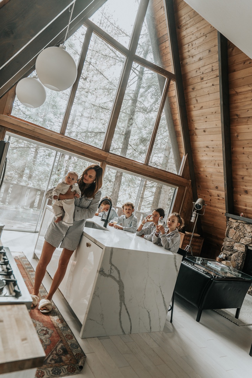
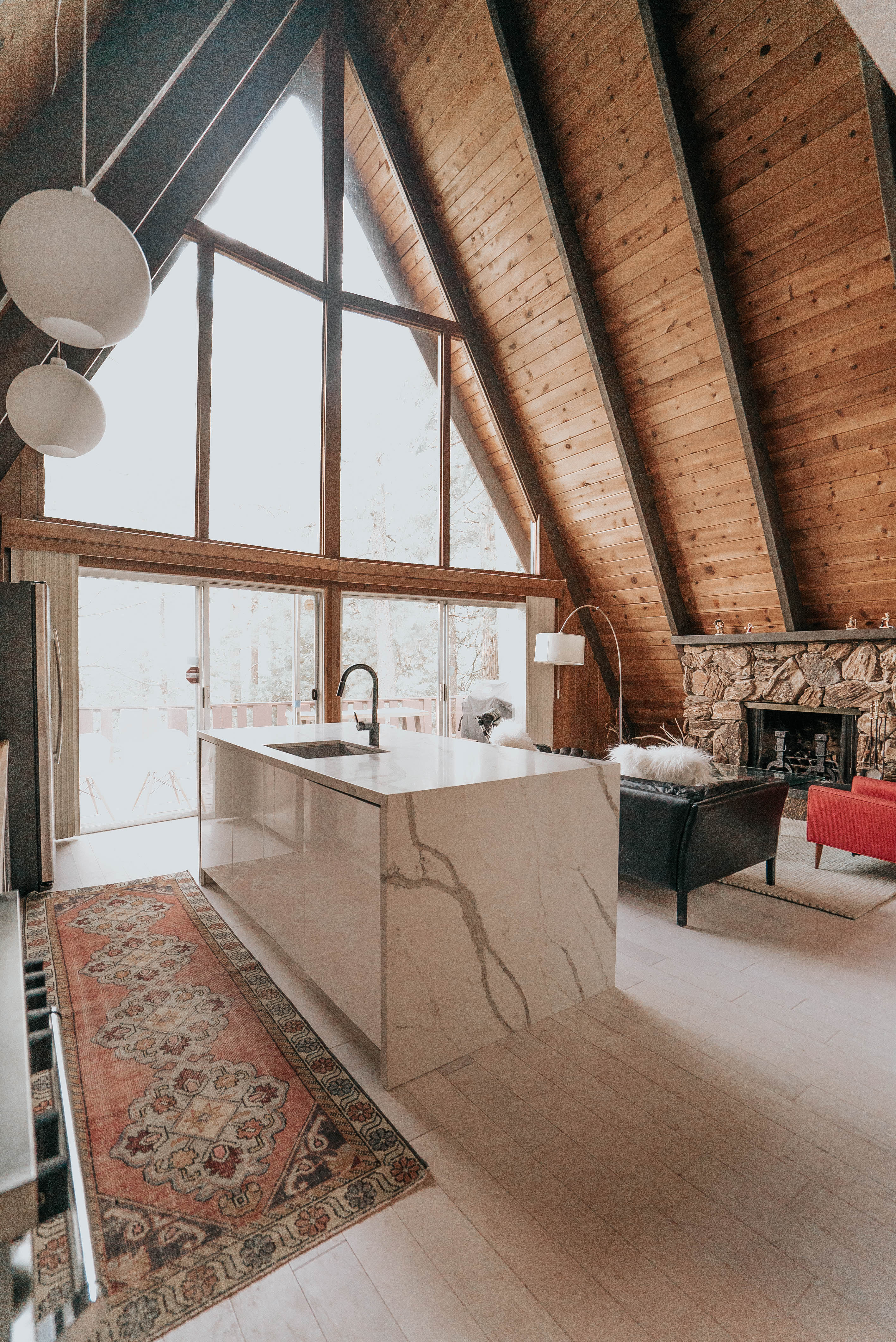
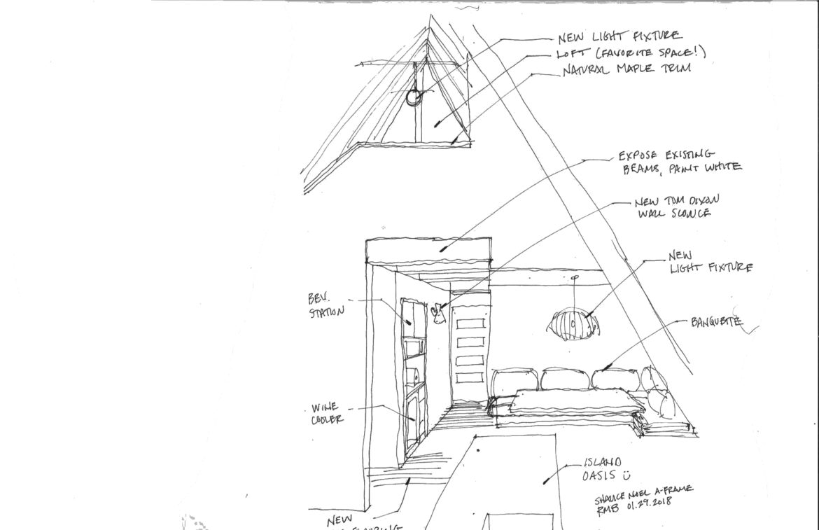
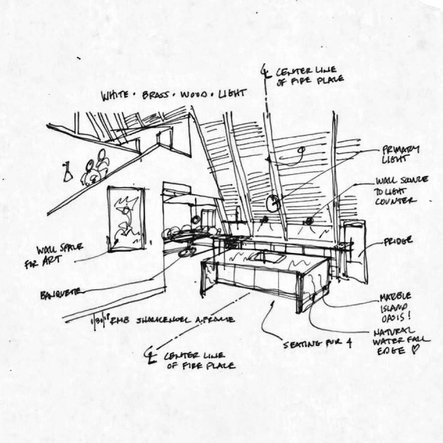
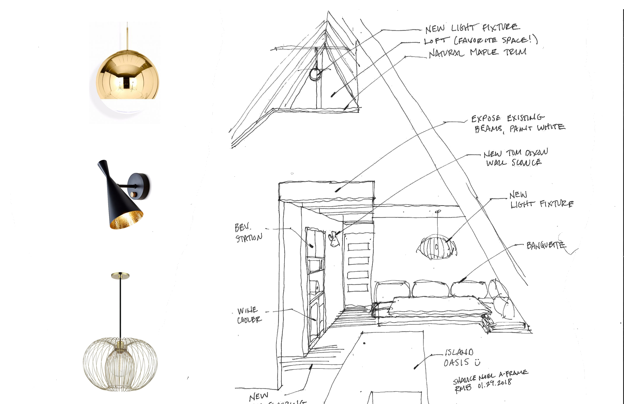
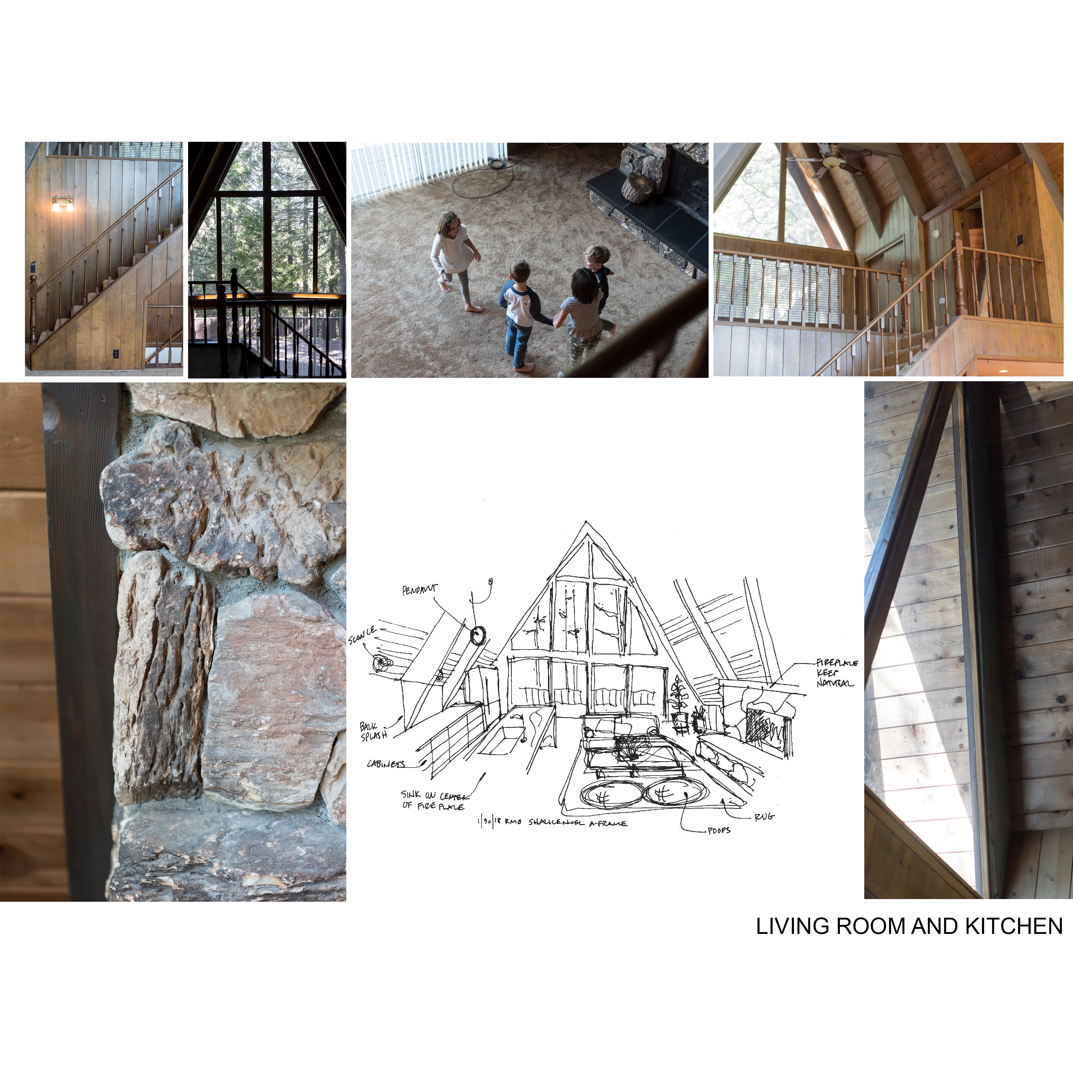
Thankfully Reid was up to the challenge of designing my dream kitchen and started sketching some conservative ideas. We started the design process thinking we would keep everything as is and only update cabinetry, countertops and appliances. But as we continued to sketch (and re-sketch), my desire for an island started to change things and Reid just couldn’t make it work with the original layout. To bring this 1969 A-Frame into 2018 we knew the kitchen belonged in the main living space, under the amazing ceiling and across from the stone fireplace. So, Reid re-planned the space from scratch. The good news is, the sink is all that needed relocated. The fridge moved to a corner with an existing outlet and the stove location only rotated 90 degrees, so the gas line only required minor modification.

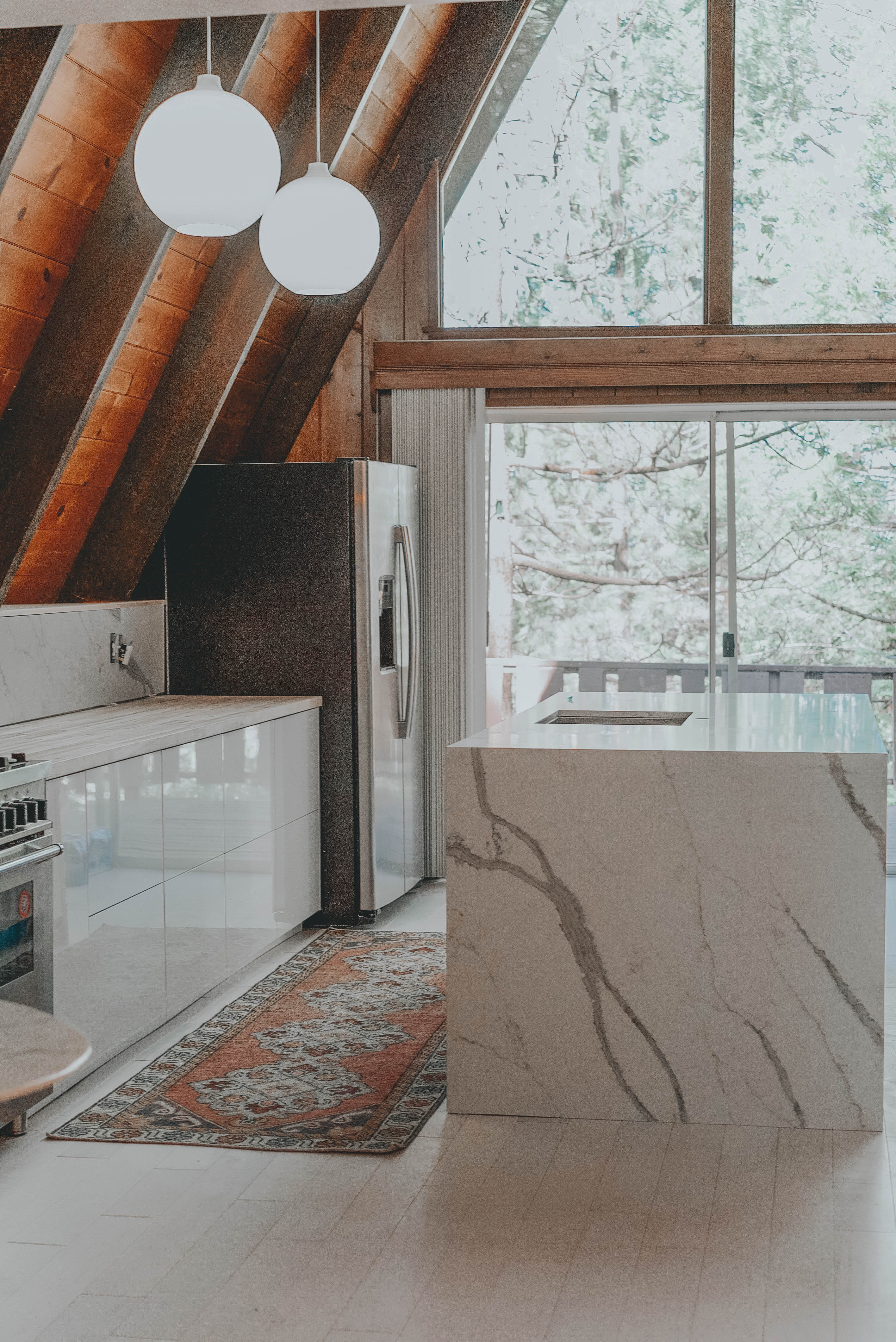
Reid stayed true to general rules for kitchen design using the “working triangle.” If you’re not sure what that means, it’s when the location of the stove, sink and fridge form a triangle and create an easy flow for working in the kitchen. As a bonus, the sink aligns perfectly on center with the fireplace and the view from the sink is beautiful—something I’ve never had in a house before.

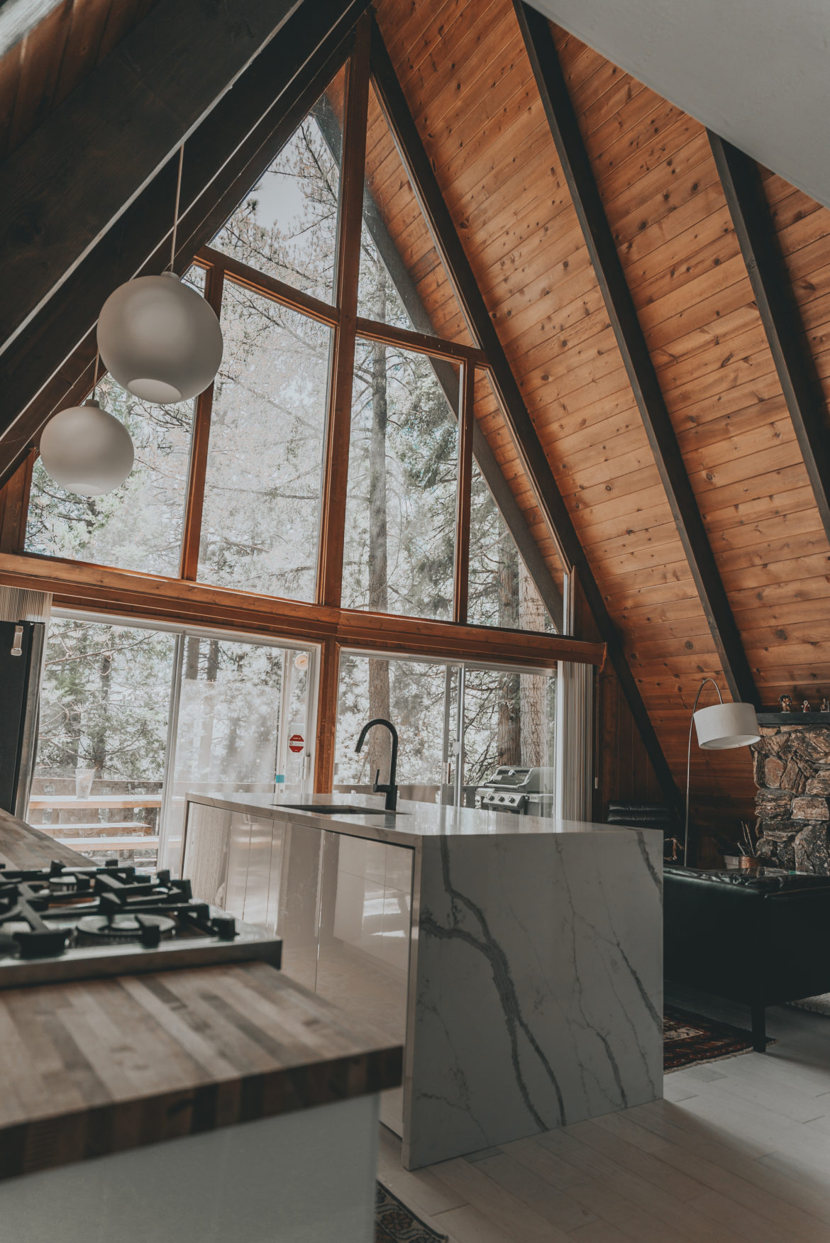
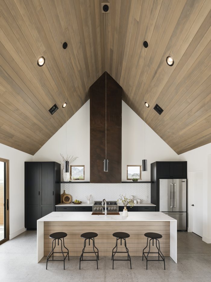
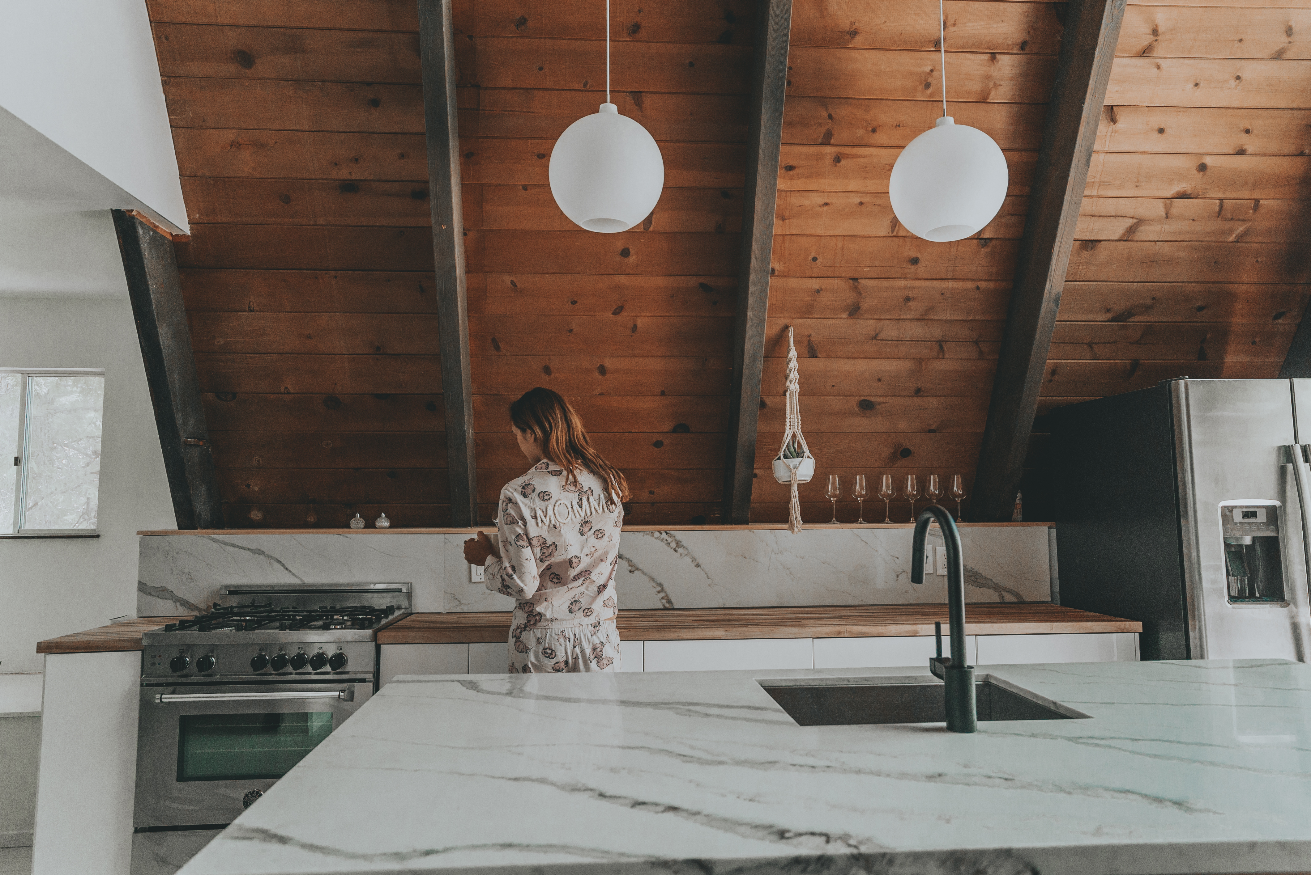
To maintain symmetry, we flanked the stove and fridge on opposite sides of the sink. This gives us uninterrupted counter space, and with no upper cabinets, the space doesn’t feel crowded. The sloped ceiling made upper cabinets nearly impossible, but we did discover we could create an open shelf that would have been lost behind a wall if we hadn’t sketched everything out accurately. I would definitely suggest not skipping the sketching phase of planning/designing your space, even if you don’t have an architect or contractor in the family.

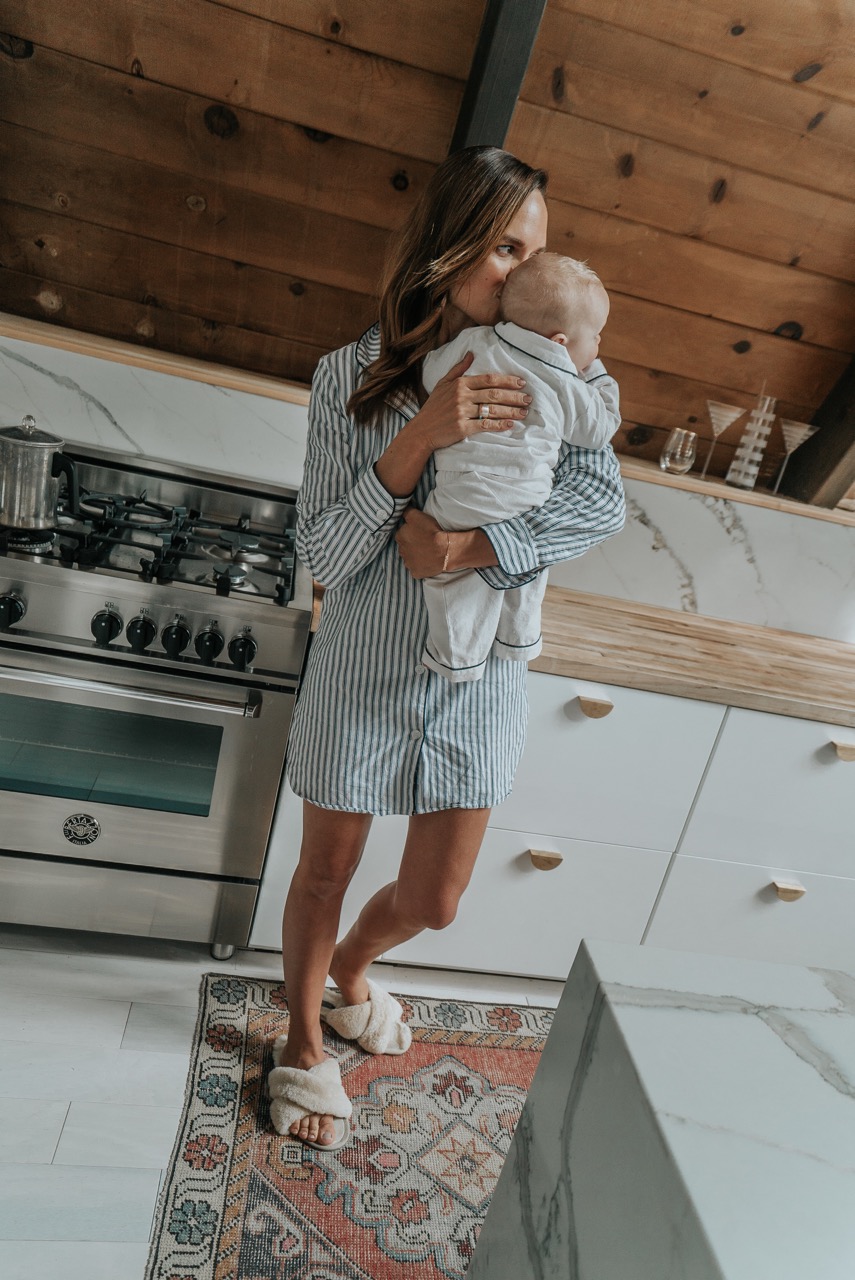
For materials we decided to go with a modern IKEA cabinet door called Ringhult. The description said it was easy to clean with kids, so we were sold! If I had to do it over again, though, I may have picked the cabinet that has the integrated door pull. Hardware is just another step and additional cost that prolongs finishing a space.

We debated on countertops for weeks. But as we were purchasing our flooring from Lumber Liquidators, we saw they had maple butcher block counters and we were sold. The price was good and the install was simple. We used the butcher block along the counter against the wall. The contrast of the natural wood and the glossy cabinet doors softened the contemporary aesthetic.

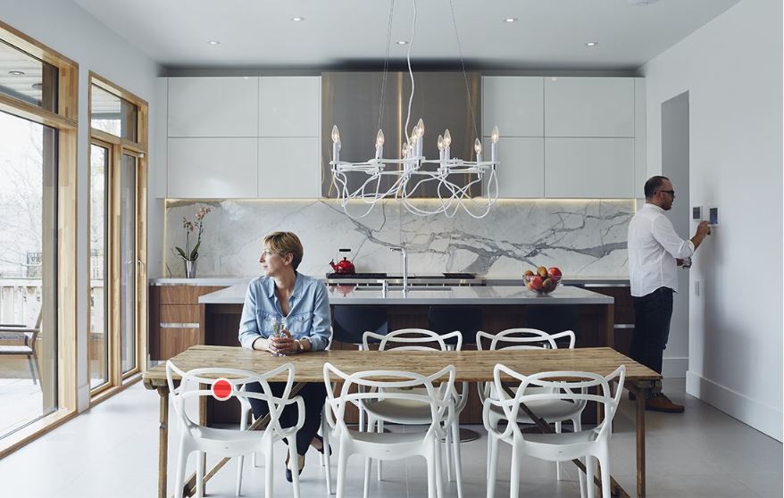
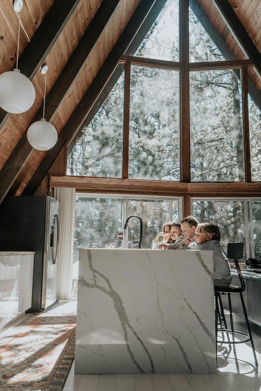
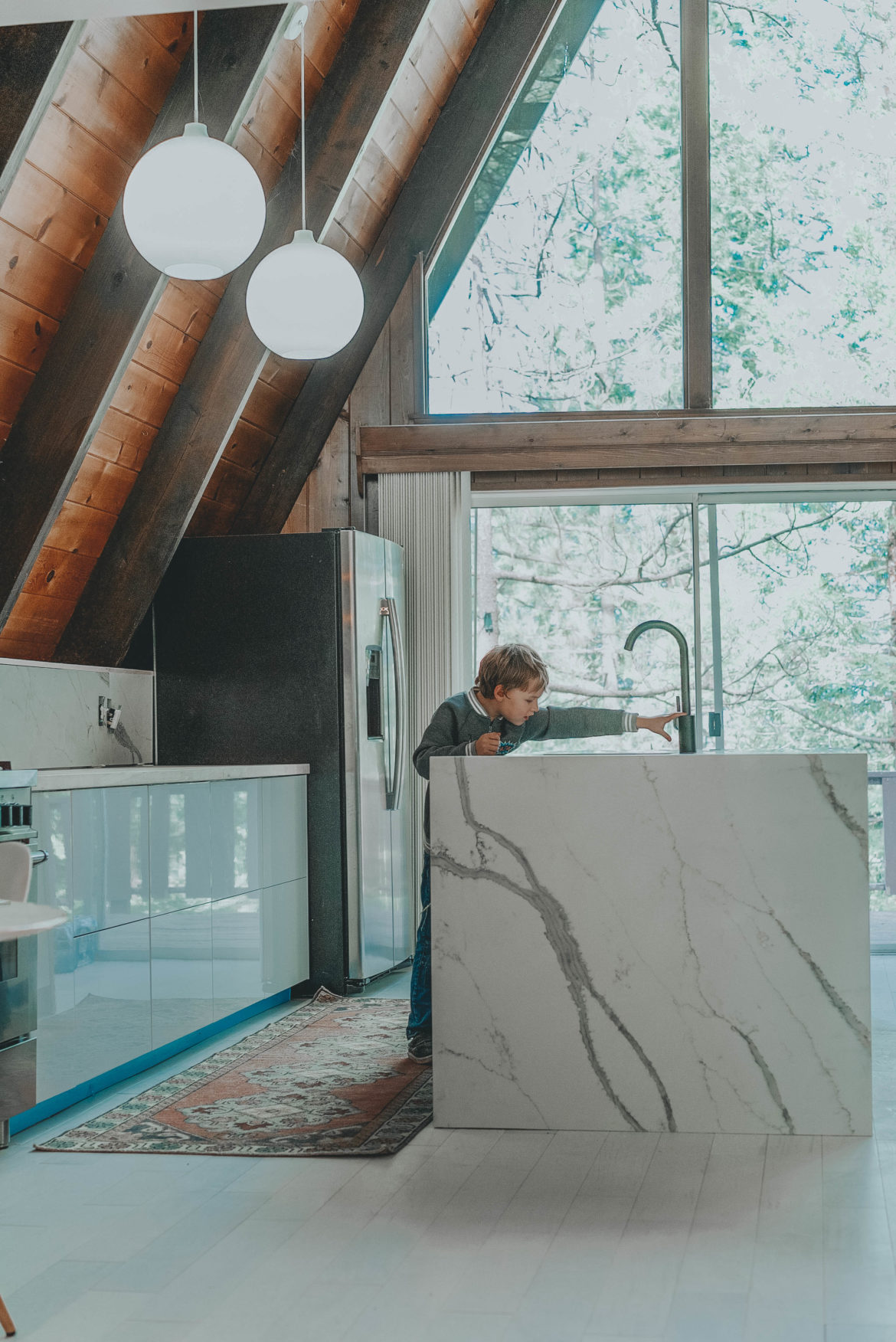
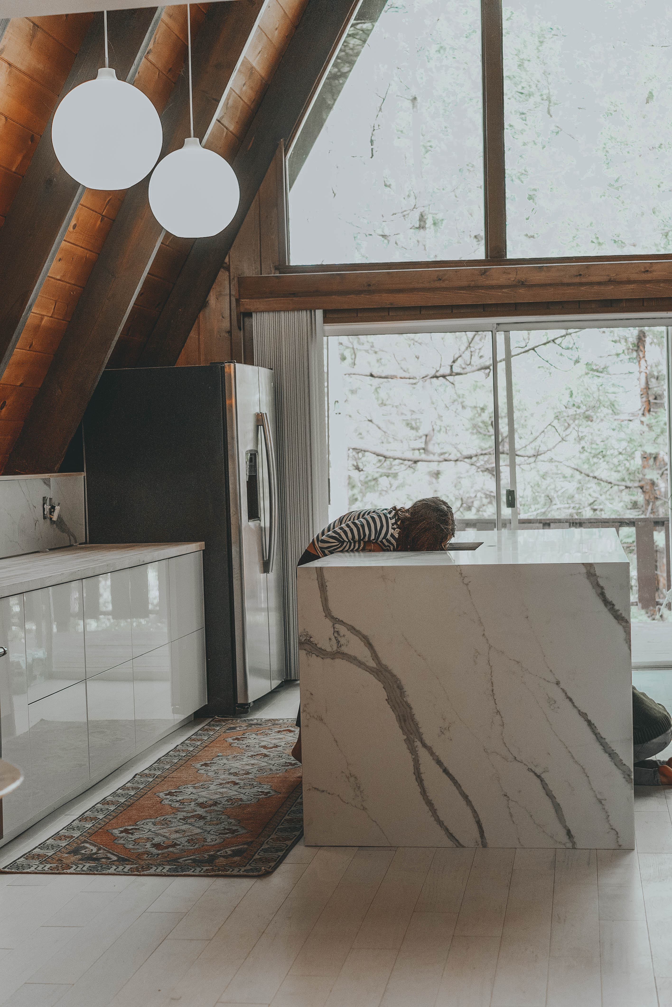
For the island, we wanted drama. After many pins on Pinterest and several Instagram saves, we looked into getting natural marble with waterfall sides. We shopped some marble yards in LA but found the prices to be ambiguous and seemingly deceptive. We came close to purchasing a couple marble slabs but had a suspicion we weren’t getting what we were paying for. My instincts (and Reid’s) said run. So we did. We ended up going with a quartz counter based on advice from some of my blogger friends. We also looked outside of LA and got a much better price for both the slabs and the fabrication. It’s a nerve-racking process, but once installed, we got the drama we were holding out for.

When it came to the hardware and faucet, we wanted modern sophistication so we chose a sleek black Moen faucet and brass half moon door handles (yet to be installed!). The Turkish runner between the cabinets adds a rustic vibe and some color—a nice balance for the more modern island. It is a cabin after all.

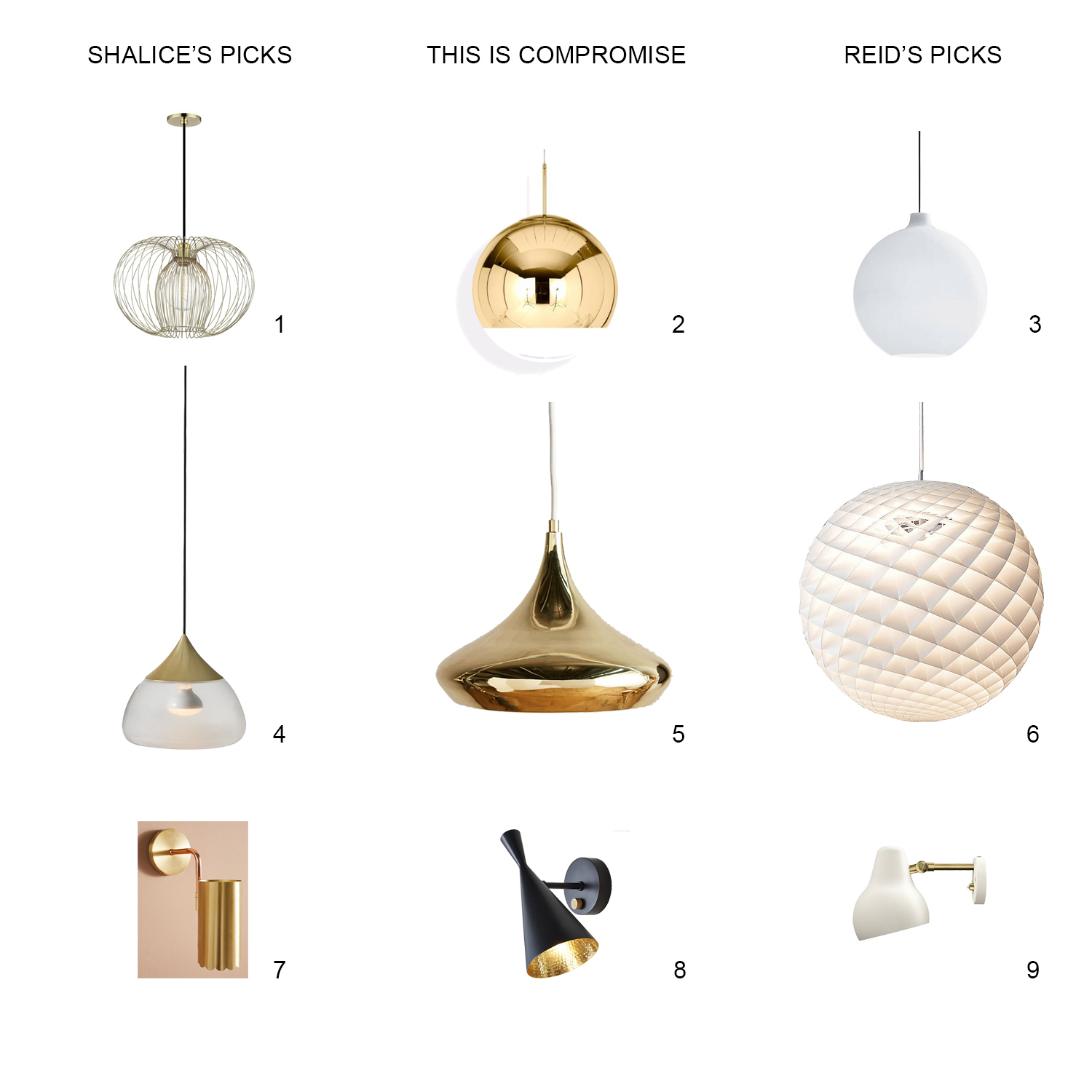
And finally, you may remember this post where we were deciding on his and her light fixtures. Well, guess what? We went with his choice. The round white globes float above the kitchen peacefully and offer plenty of light. The strong geometry of the spherical shape also compliments the harsh angles of the A-Frame. So, Reid was right! And a fun fact—they’re Louis Poulsen light fixtures, which is the mid-century designer behind the famous artichoke light! 

Now I’m on the hunt for black Bertoia bar stools. Keep an eye out! Who wants to cook in this kitchen? Wait till you see the banquet. That will be next!

To rent our cabin on Airbnb, click here


Sources

Light “Wohlert”  Louis Poulson // Stone Quartz from Stone Systems LLCPolarStone Quartz 2CM – 120″x63″ Calacutta Manhattan 5111″ // Bar Stools 

// Flooring Whitewashed Engineered Hickory from Lumber Liquidators // Runner rug Etsy // Butcher Block in Maple Lumber Liquidators // IKEA cabinets “Ringhult” // Moen Matte Black Faucet //  Stove 30″ Range Bertazzoni Italia // Oval Marble Table

Before/After


We announced over the weekend that our A Frame cabin kitchen is ALMOST finished! The island waterfall countertop was installed in addition to the matching surface backsplash. There was huge anticipation around this delivery and installation as we had a difficult time finding sources for just the right surface and a reliable fabricator! After some research and countless quotes, weighing the pros and cons of marble over quartz, veins or less veins, etc. I knew for sure I wanted a waterfall design as this was the “jewelry” in a sense of the kitchen. It being cozy and in a cabin, it is eye-catching to see a glam slab of marble vein in a vast space of abundant pine! The other pro of choosing quartz was the fact that we will be renting this cabin out when we aren’t using it. Having renters means we cannot control what they do and spills and stains are inevitable. I still love marble but this quartz won our hearts. The exact name is “PolarStone Quartz” and we purchased 2CM – 2 slabs of 120″x63″ in “Calacutta Manhattan 5111.” While we still are not finished with the kitchen, stay tuned for updates coming. Again, thanks for following along!

Xx

Shalice

Sources

Light “Wohlert”  Louis Poulson // Stone Quartz from Stone Systems LLCPolarStone Quartz 2CM – 120″x63″ Calacutta Manhattan 5111″

// Flooring Whitewashed Engineered Hickory from Lumber Liquidators // Runner rug Etsy // Butcher Block in Maple Lumber Liquidators // Cabinets IKEA // Stove 30″ Range Bertazzoni Italia //


M O R E

Rugs I’m loving

Sconces I’m considering

Fave Couches on the list

Bar Stools for the Island


A-Frame Before Pictures

by Shalice Noel

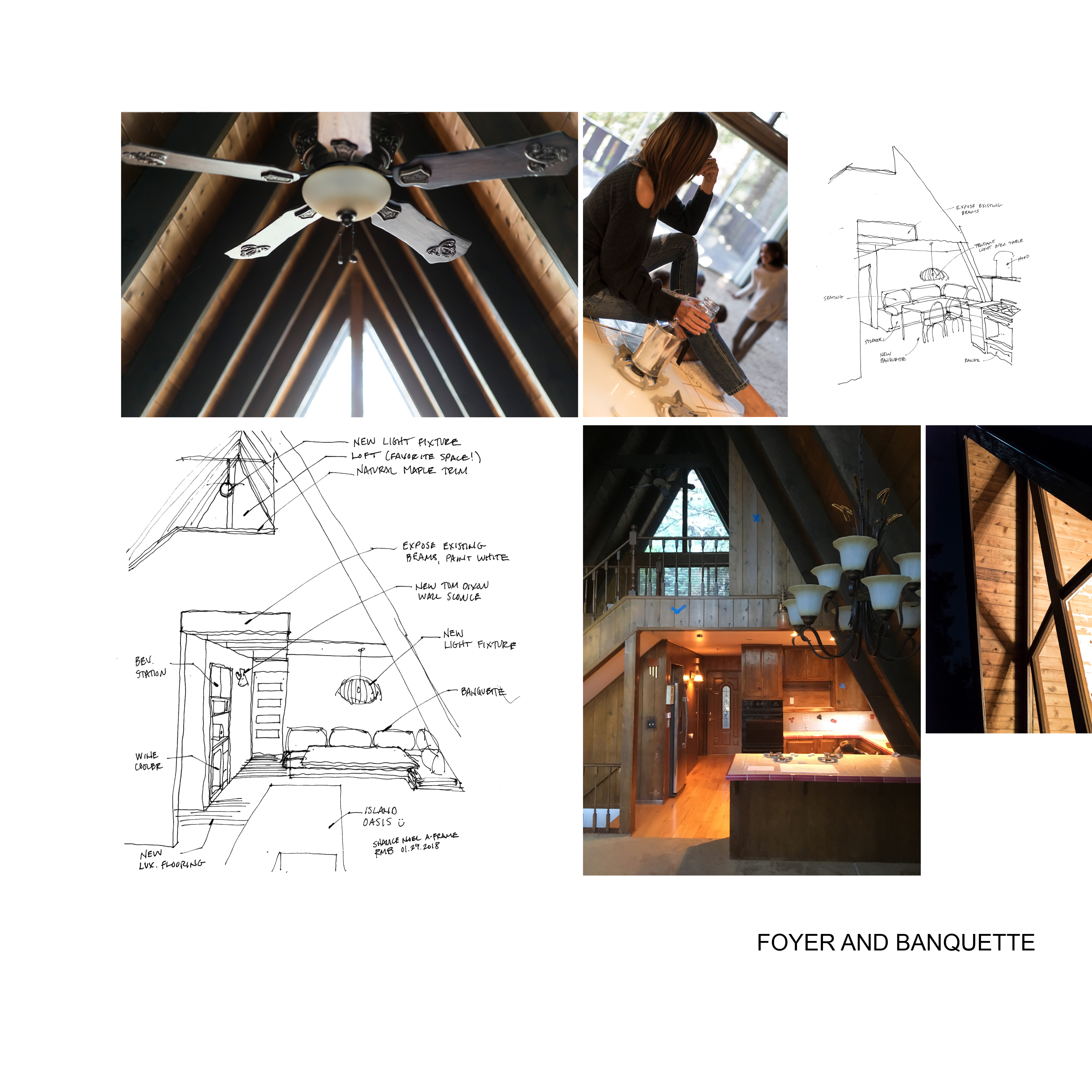
Today, I’m sharing something a little different than fashion, the BEFORE and design plans for our A-Frame Cabin. A lot of you requested to see more so here it is as promised! We were there last weekend, and we were more than ever itching to get this cabin in working order! I’m already planning our long weekends there with slow pancake breakfasts, day hikes, and evening fire with s’mores. Read on!

The A-Frame is historically known as one of the most economical structures to build, which is why the shape has become popular for country retreats.  We’ve been eyeing the quaint but dramatic structures for a year now.  The one we ended up purchasing had everything on our list, 4 bedrooms, 3 baths, loft and floor to ceiling glass.

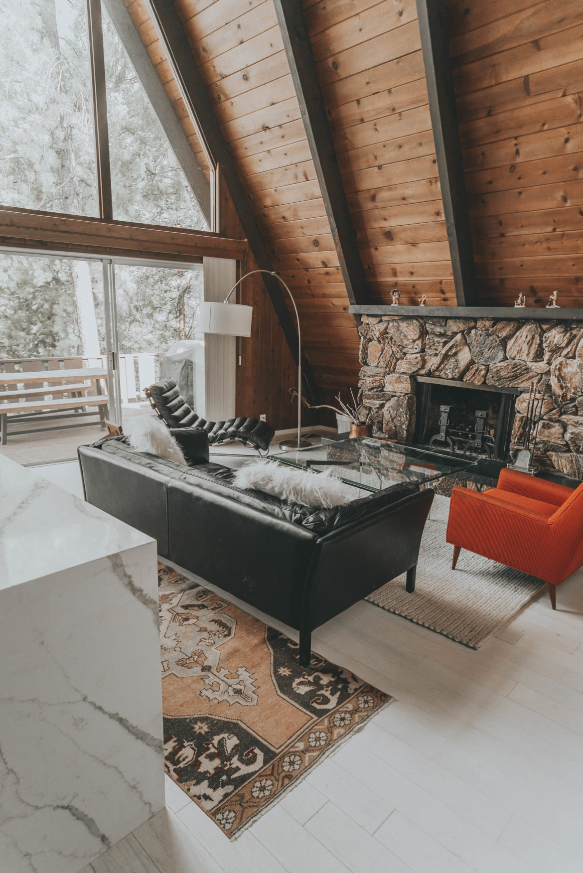
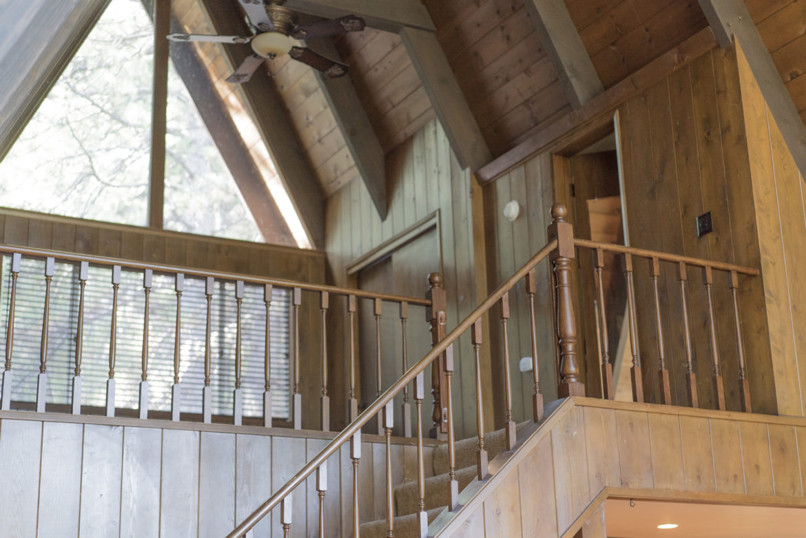
The day we went under contract Reid and I started visioning the vibe we wanted for the space.  Other than the updated bathrooms, the interior really hasn’t been touched since 1969.  While we love to keep the design true to its’ history, that means different things to different people.  To Reid, this means keeping the authentic dark wood paneling and knotty pine ceiling.  I on the other hand, see white on white on white on white ….  Reid says the painted white stone fireplace would look like a marsh mellow.  Once my hair guy said not to paint the stone, then I agreed with Reid.  As the design unfolds, you’ll notice how we compromise.  Our intent is to design a space that brings LA glam to LA (Lake Arrowhead) retreat. The design will provide vertical wall space for artwork, move the kitchen into the sanctuary space of the living room and create amenities that will bring the families together.  If I could, I would wallpaper the walls in that overly chunky thick, knitted blanket that is everywhere on Instagram these days.

Stay engaged as we pour out our design process, kick into demolition and refresh this tired A-Frame back to its A GAME. Read more about our purchase here. What do you think?

XOXO friends

Shalice


one // two // three //

four // five // six //

seven // eight // nine //


Marriage is all about compromise right? I’d like to say its a rare occasion when Reid and I differ on design and design materials, but it happens. Just recently picking out flooring for the A Frame, we differed, I wanted white barn flooring, he a blonde natural color. You can also see illustrated above, my picks, and his picks and thankfully – the middle ground! Phew.  Which are your faves? As promised, I will be sharing more of our top picks and design plans of the 1970’s A Frame we are renovating, get excited! Don’t forget to sign up for my newsletter (on my blog’s homepage) read more about it here and stay tuned!


All the best!

Shalice