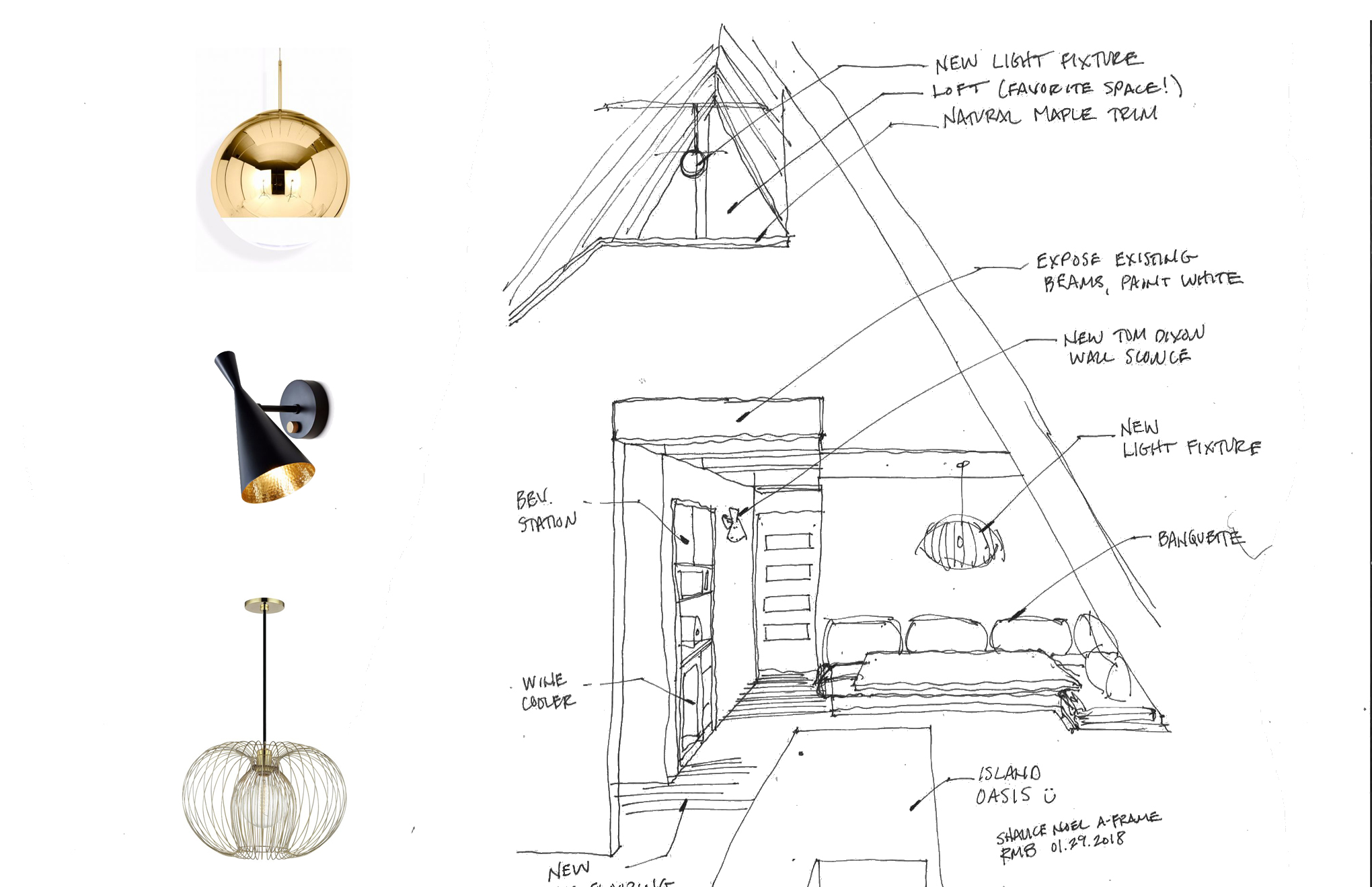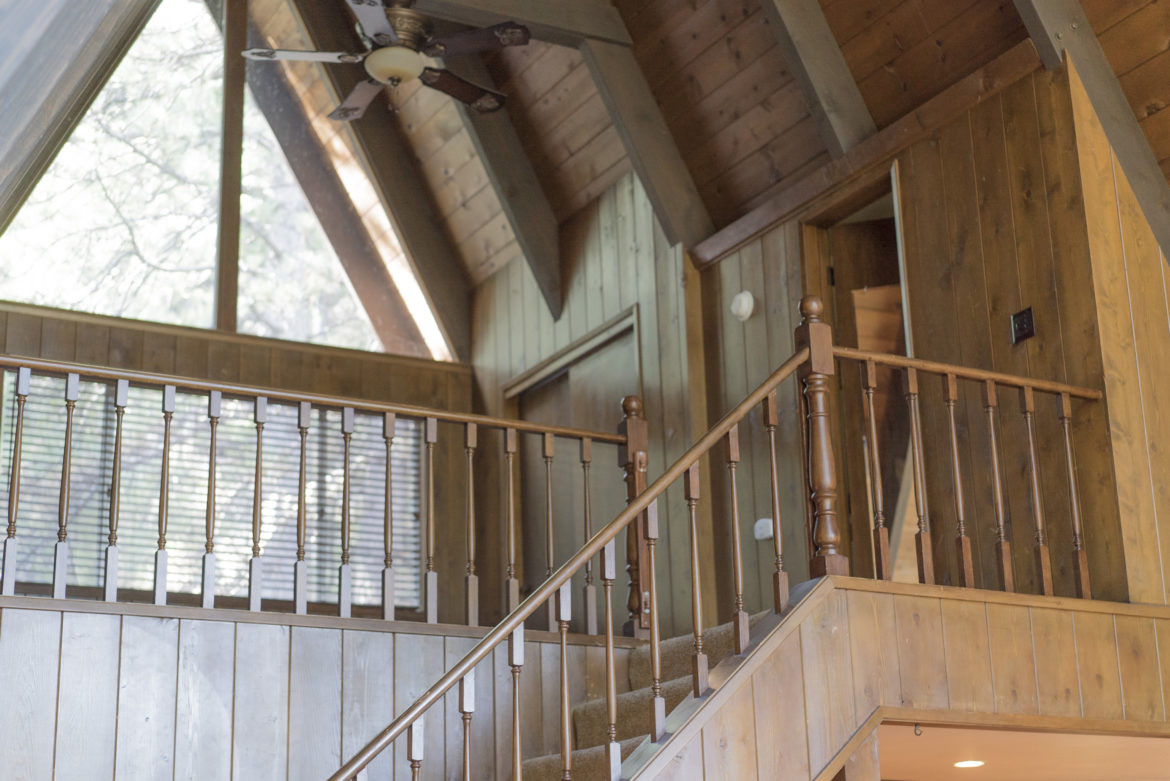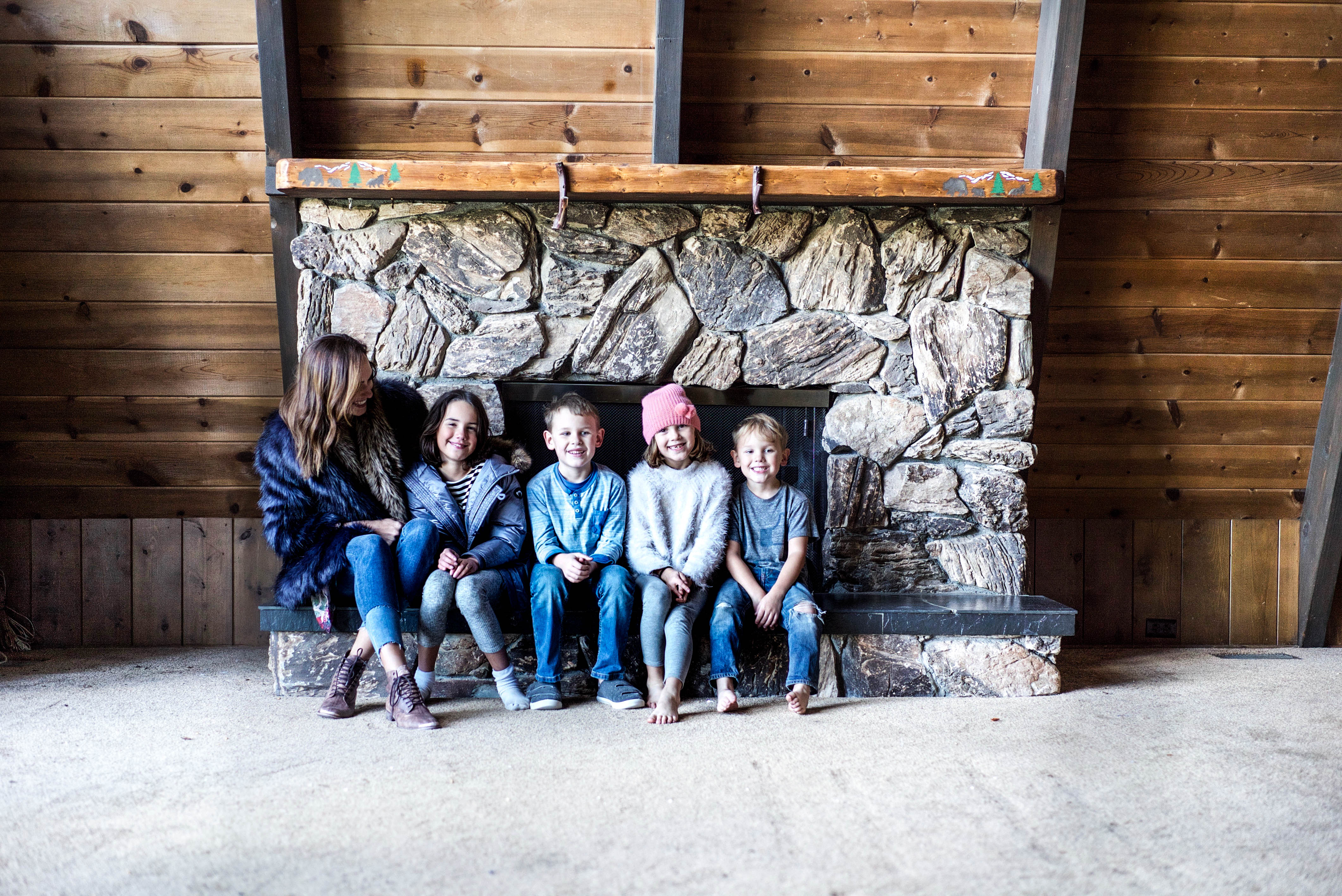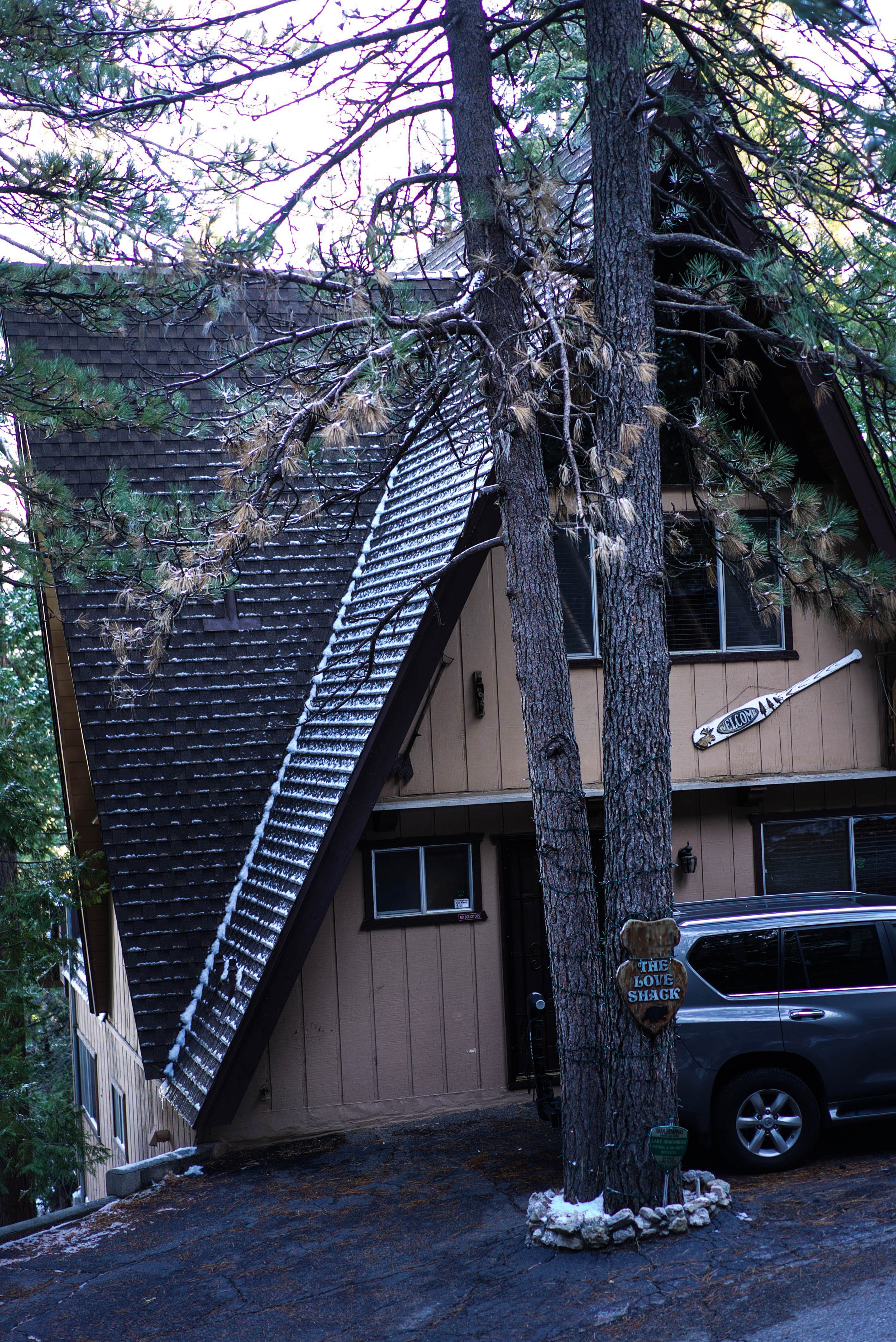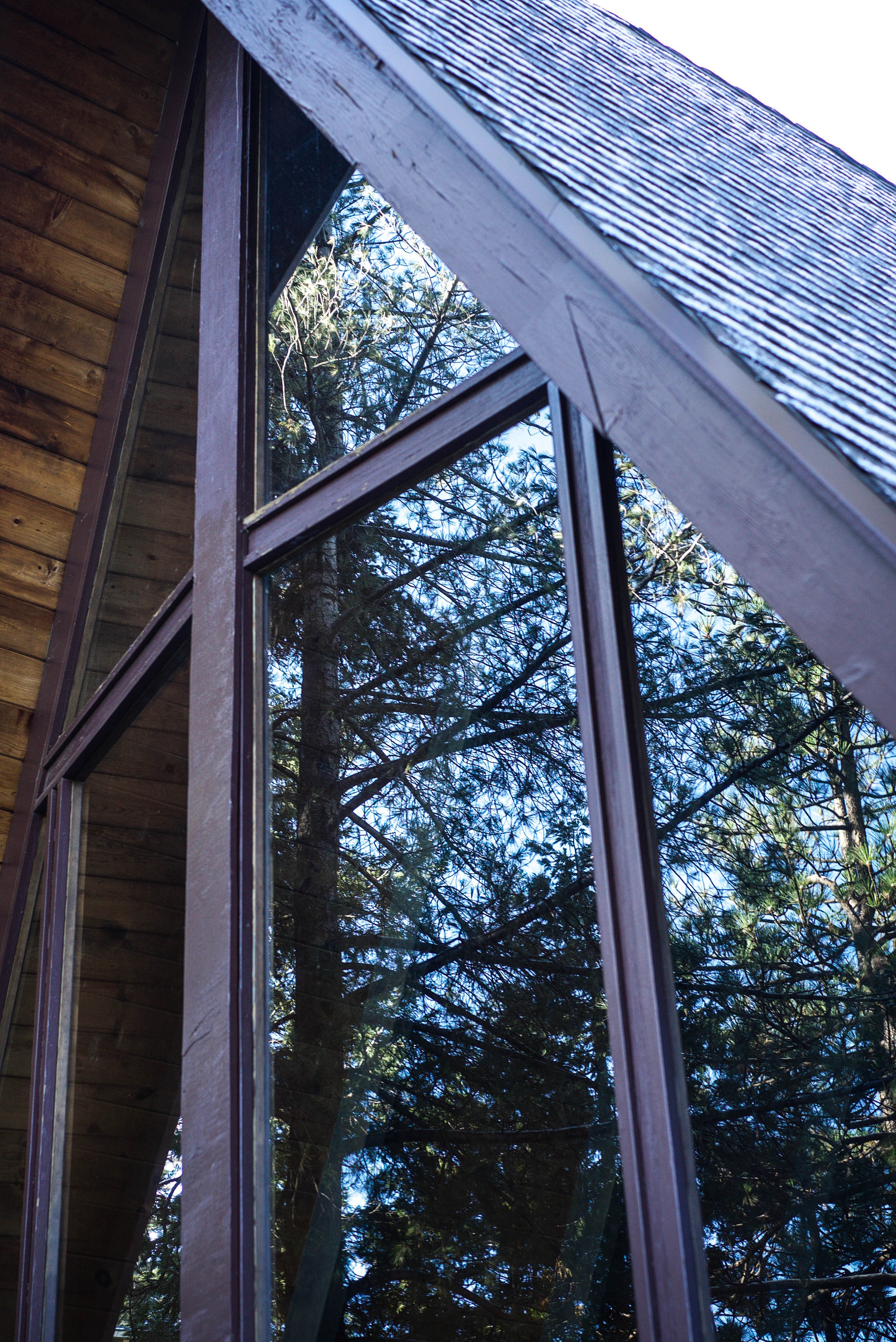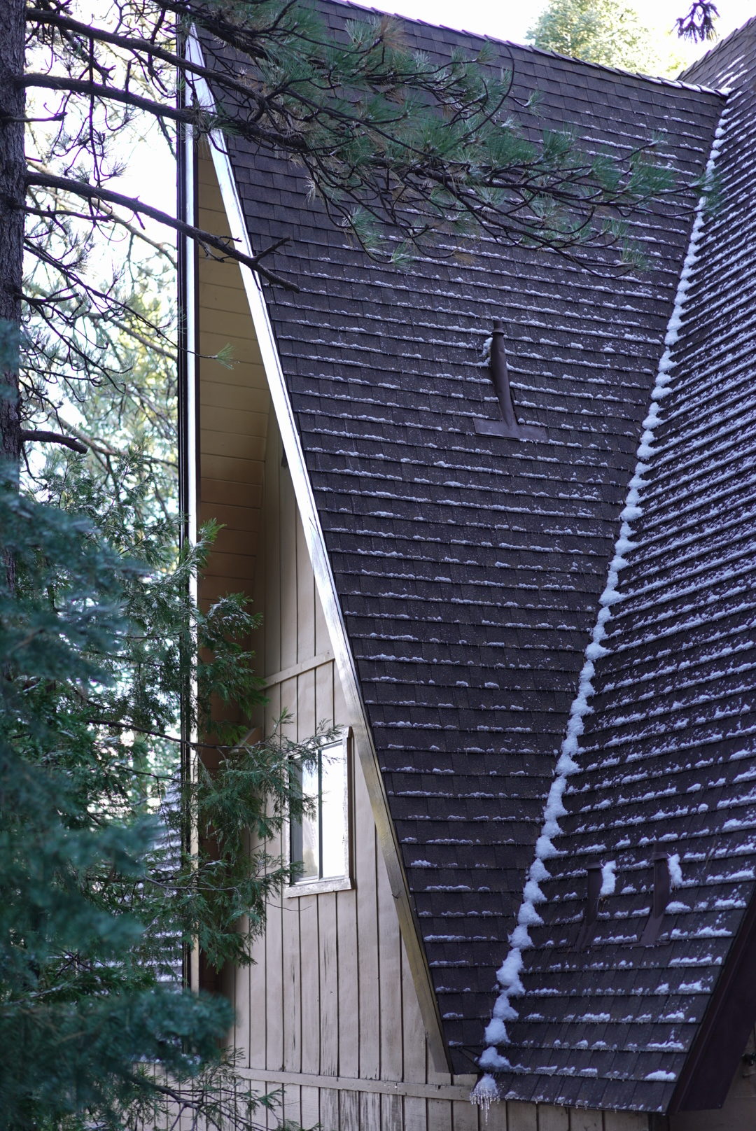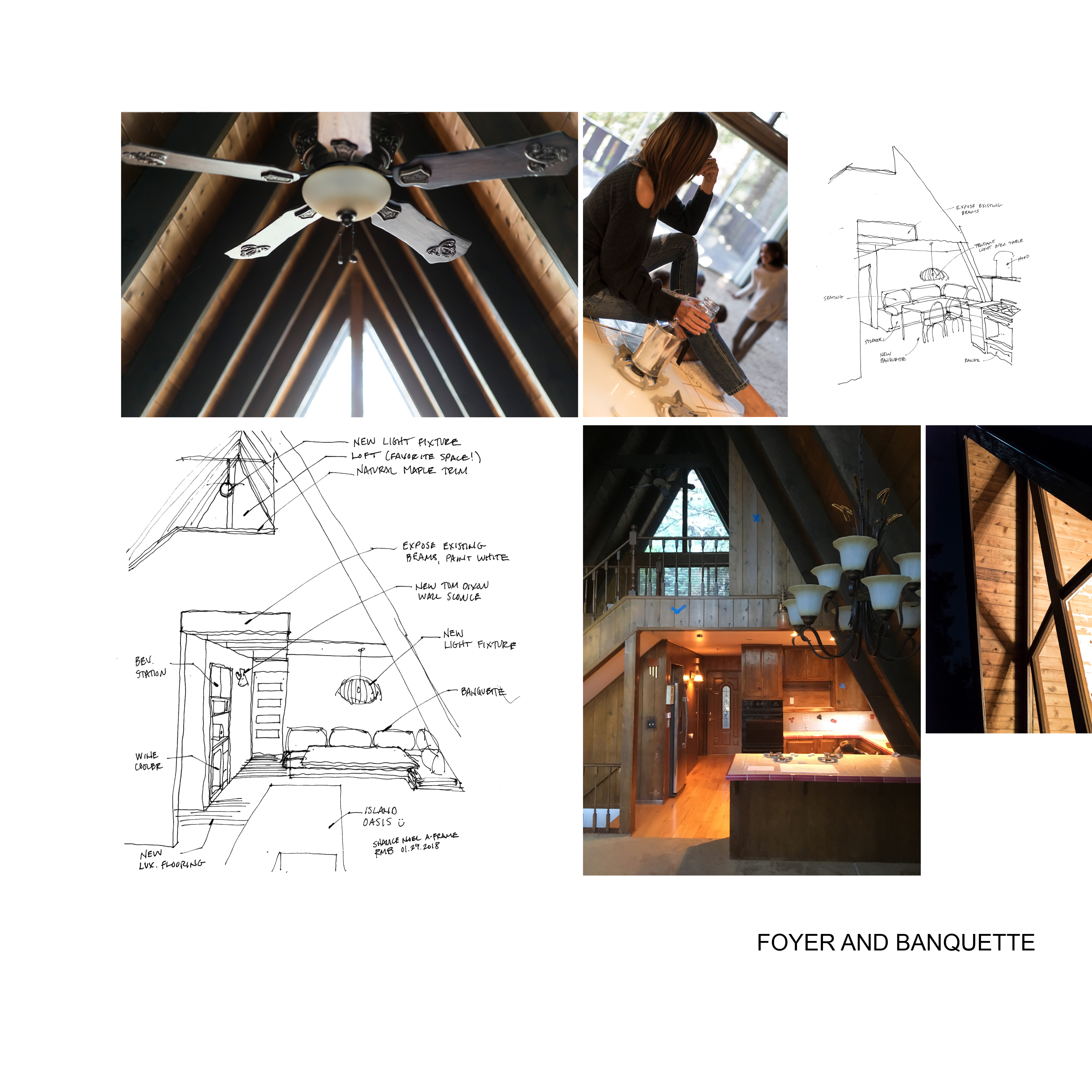

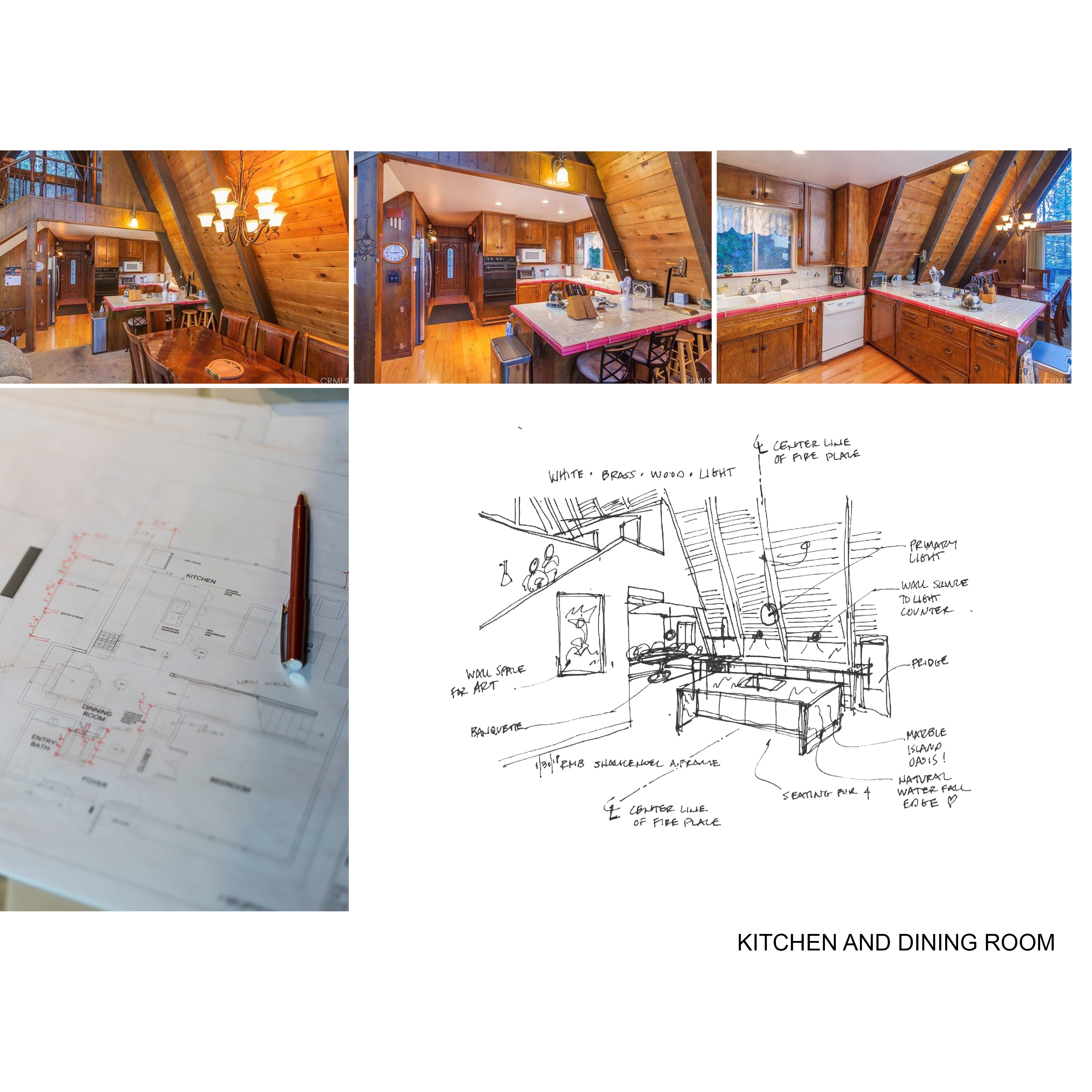
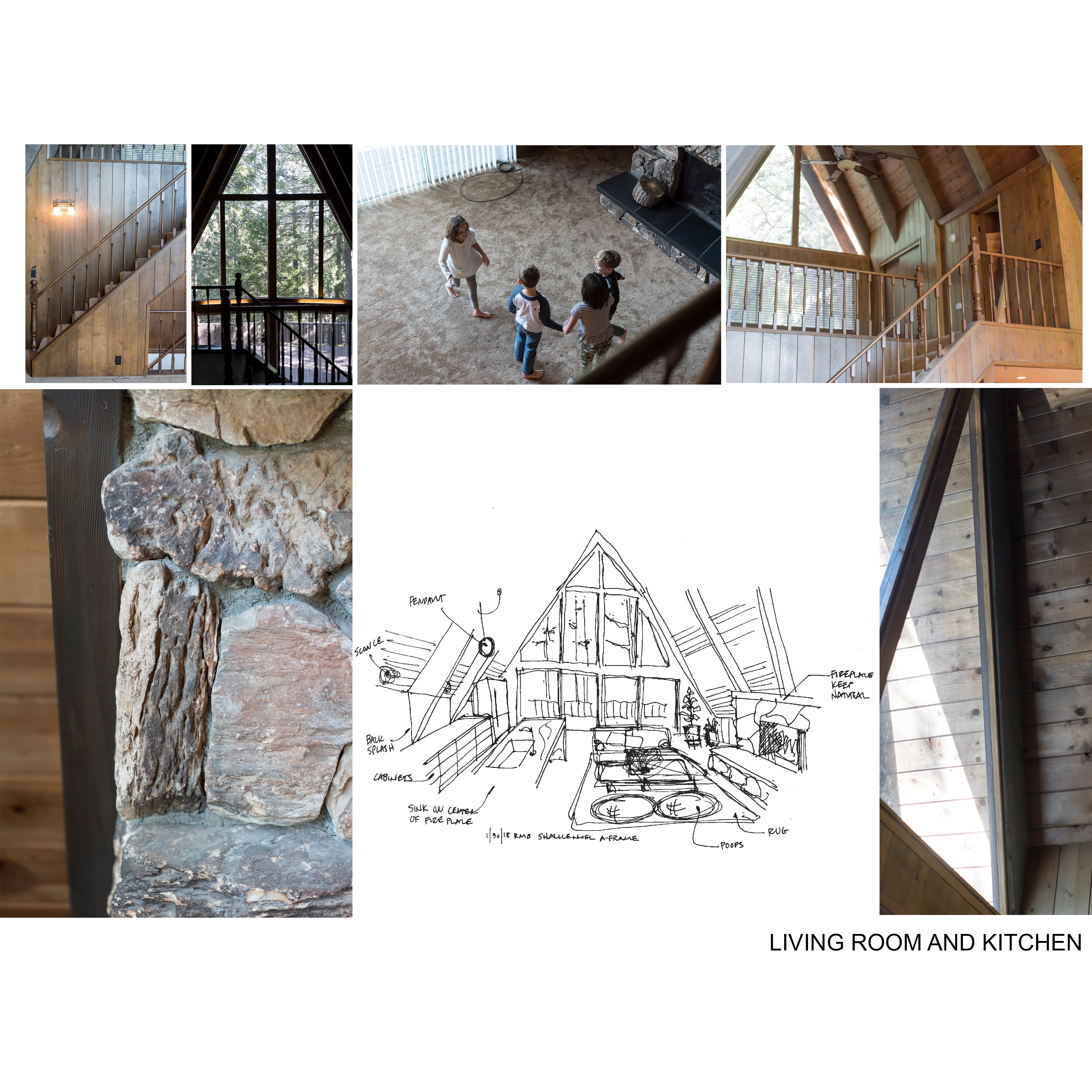
 Today, I’m sharing something a little different than fashion, the BEFORE and design plans for our A-Frame Cabin. A lot of you requested to see more so here it is as promised! We were there last weekend, and we were more than ever itching to get this cabin in working order! I’m already planning our long weekends there with slow pancake breakfasts, day hikes, and evening fire with s’mores. Read on!
The A-Frame is historically known as one of the most economical structures to build, which is why the shape has become popular for country retreats. We’ve been eyeing the quaint but dramatic structures for a year now. The one we ended up purchasing had everything on our list, 4 bedrooms, 3 baths, loft and floor to ceiling glass.
The day we went under contract Reid and I started visioning the vibe we wanted for the space. Other than the updated bathrooms, the interior really hasn’t been touched since 1969. While we love to keep the design true to its’ history, that means different things to different people. To Reid, this means keeping the authentic dark wood paneling and knotty pine ceiling. I on the other hand, see white on white on white on white …. Reid says the painted white stone fireplace would look like a marsh mellow. Once my hair guy said not to paint the stone, then I agreed with Reid. As the design unfolds, you’ll notice how we compromise. Our intent is to design a space that brings LA glam to LA (Lake Arrowhead) retreat. The design will provide vertical wall space for artwork, move the kitchen into the sanctuary space of the living room and create amenities that will bring the families together. If I could, I would wallpaper the walls in that overly chunky thick, knitted blanket that is everywhere on Instagram these days.
Stay engaged as we pour out our design process, kick into demolition and refresh this tired A-Frame back to its A GAME. Read more about our purchase here. What do you think?
XOXO friends
Shalice
