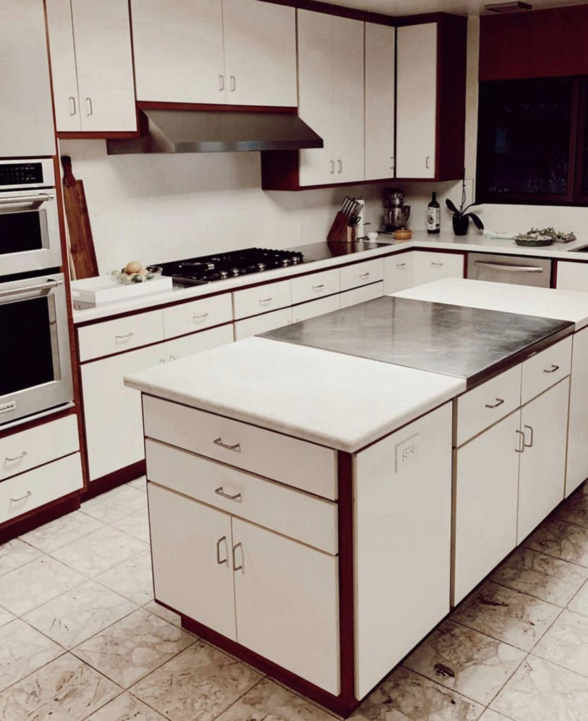

Make sure to check out our house tour on IGTV before you read this post. It will show you the best before content. When we purchased our new home we knew a kitchen renovation would be in our near future. We held off renovating it for half a year to really get a feel for what was working and what didn’t work in the existing kitchen. What we discovered was the kitchen had too many cabinets, it was dark and we really wanted seating at the large island. The multi-colored finishes was an eyesore and oh…did I mention…never own white laminate countertops. Those babies were stained within a month of us moving in. No joke. The pomegranate stains never came out!
As we started the design process for the kitchen, we considered the modern aesthetic we typically like with some touches of drama. We did lots of pinning on Pinterest for a design wish list. However, our house has a distinct style and we wanted our new kitchen to reflect its unique style. We gave up some ideas for the sake of a holistic home design. We were inspired by simple, bright Danish style kitchens with neutral colors to harmonize our existing terrazzo tile flooring and modern Asian home aesthetic. Mission, accomplished.
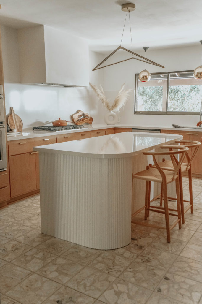
We liked the layout of our kitchen and the original custom cabinets were in great condition, so we chose to resurface the cabinets with new soft close doors. We chose Birch wood slab doors and Cambria “Whitehall” quartz counters to keep the kitchen bright and neutral. A nice thing about our renovation is that we were able to keep our appliances. That was a huge cost saver.
Reid and I are 100% responsible for the design of our kitchen. We used a sketch-up model to visualize our material choices but most of all used the simple modeling tool to design our custom island. My favorite part of the kitchen is the new island. We see a curve trend coming to kitchen designs. Do you remember roll top desk? Well here is our island secret. The sides of the island are cladded in tambour panels. This is the same material used to make the old roll top desk our Grandma’s owned and loved. We love the idea of using something for other than what it is intended for. We can’t wait to sit at the island, drink coffee and work on our laptops.
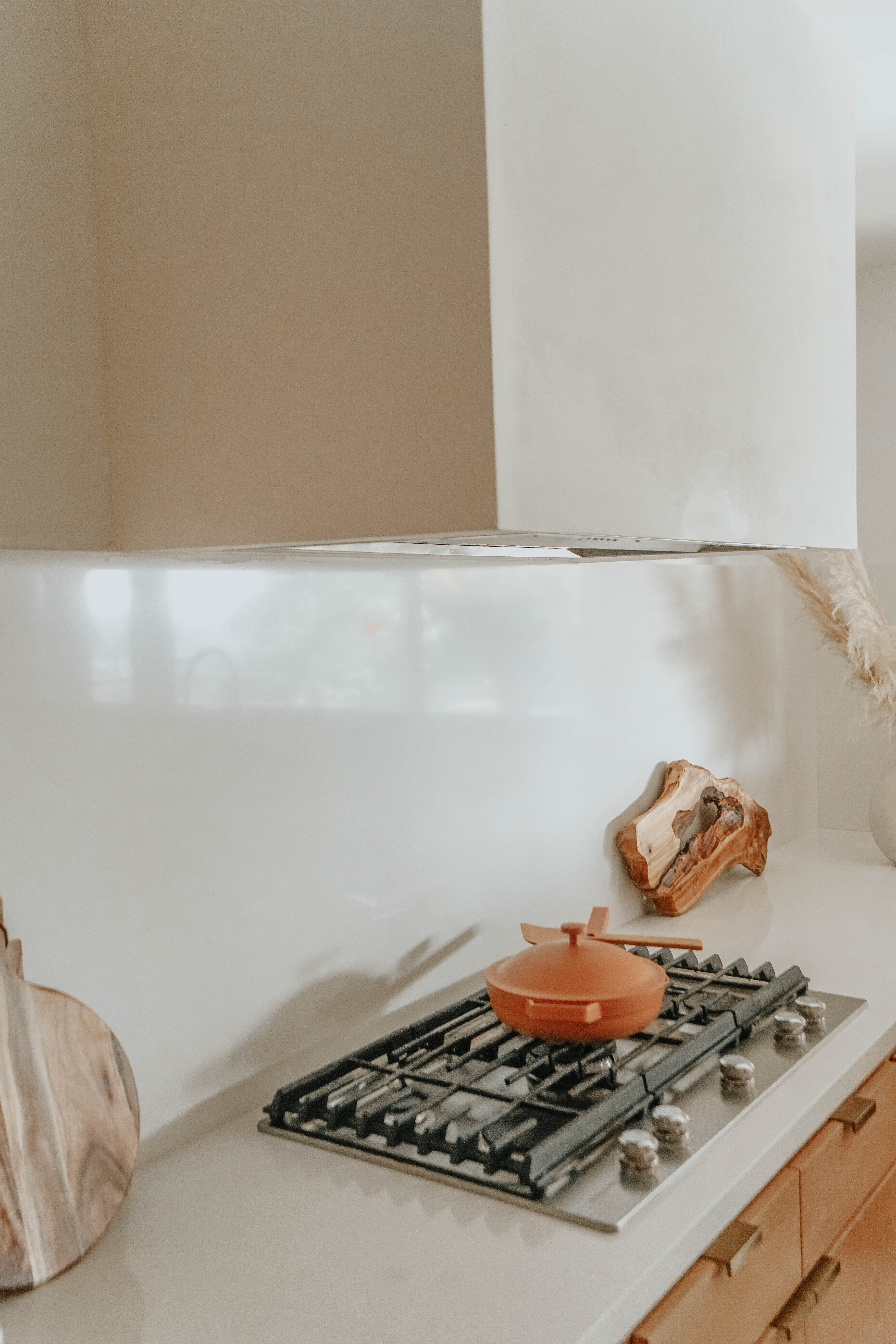
The design of the backsplash was a tough decision. There are so many options and can easily go the wrong direction. We debated using tile, but the grout lines bothered us. We thought about German shmear stone veneer, but thought it would be impractical to clean. We considered Calcutta marble, but thought the veins would compete with the terrazzo floors. So in the end, we chose the simple white route. We continued our countertops up 30” for our backsplash to align with the bottom of the hood. We also chose to go simple with the drywall hood. We used an internal hood that is already enclosed. Therefore the drywall surround is just a shell. It took Reid about 3-4 days to frame and drywall. We are really happy with how it turned out. Next step is a floating shelf flanking each side of the hood.
For lighting, we wanted gold accents. Our house already has a lot of geometric shapes, so we looked for lighting shaped with strong geometry. Enter light above the island. We liked the skinny geometry of the LED lights with the strong geometry and the fact that you can see through it. The pendant provides a good amount of light as well. We then added three identical Tom Dixon Copper Round Pendants. They hang perfectly over the sink and in front of window. We chose gold accent colors because we love how it pairs with the birch wood cabinets.
Let us know your kitchen questions. I’ve sourced all I can think of below. Please reach out with questions or just hire Reid to help!
XO SN
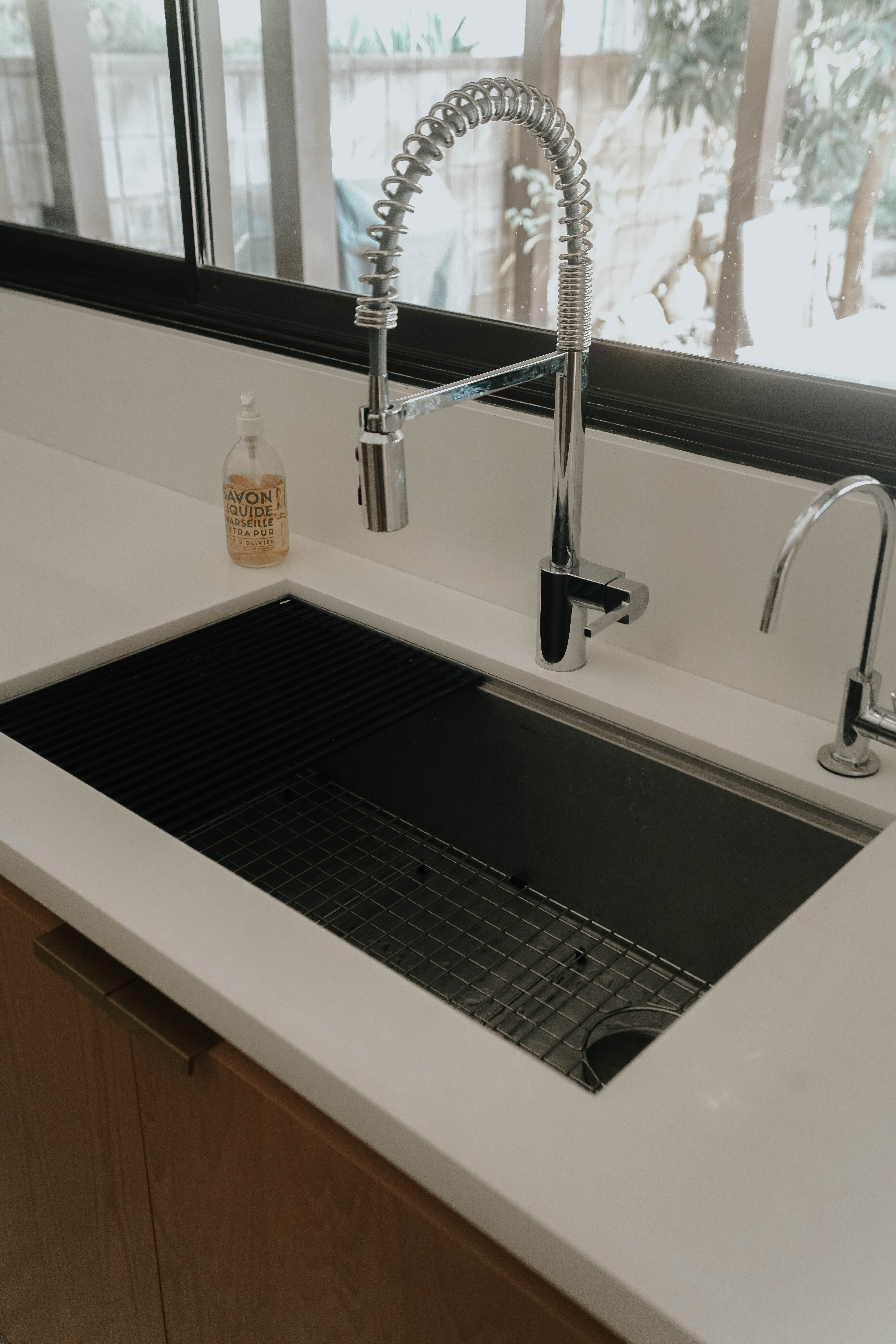
Wood tambour // Chandelier above the island // Countertop: Cambria “whitehall” // Cabinet refacing // Lights above the sink // Sink (which I love!) //Faucet by Moen // Counter top Chairs // Hardware // Hood insert


1 comment
[…] Now THIS is a kitchen renovation! That island is […]